|
Over the course of this semester, I learned several valuable techniques about art--including innovation and, most importantly, how to paint faster. I have got to admit that finishing one or two paintings every week pushed me to my limits, sometimes to the detriment of my own health. This class was a LOT of work. If I were to go back in time, I would for sure choose to take this class in senior year instead of junior year and begin working on my portfolio in the fall (this is key).
However, all of this stress did teach me how to paint faster. In the past, I used to only do one painting every few months, but now I can finish a mid-size painting in a few days. I also learned how to not be so "by-the-book" with my art and play with my colors & composition instead of copying straight from the reference. I can say without a doubt that this class influenced me greatly as an artist.
0 Comments
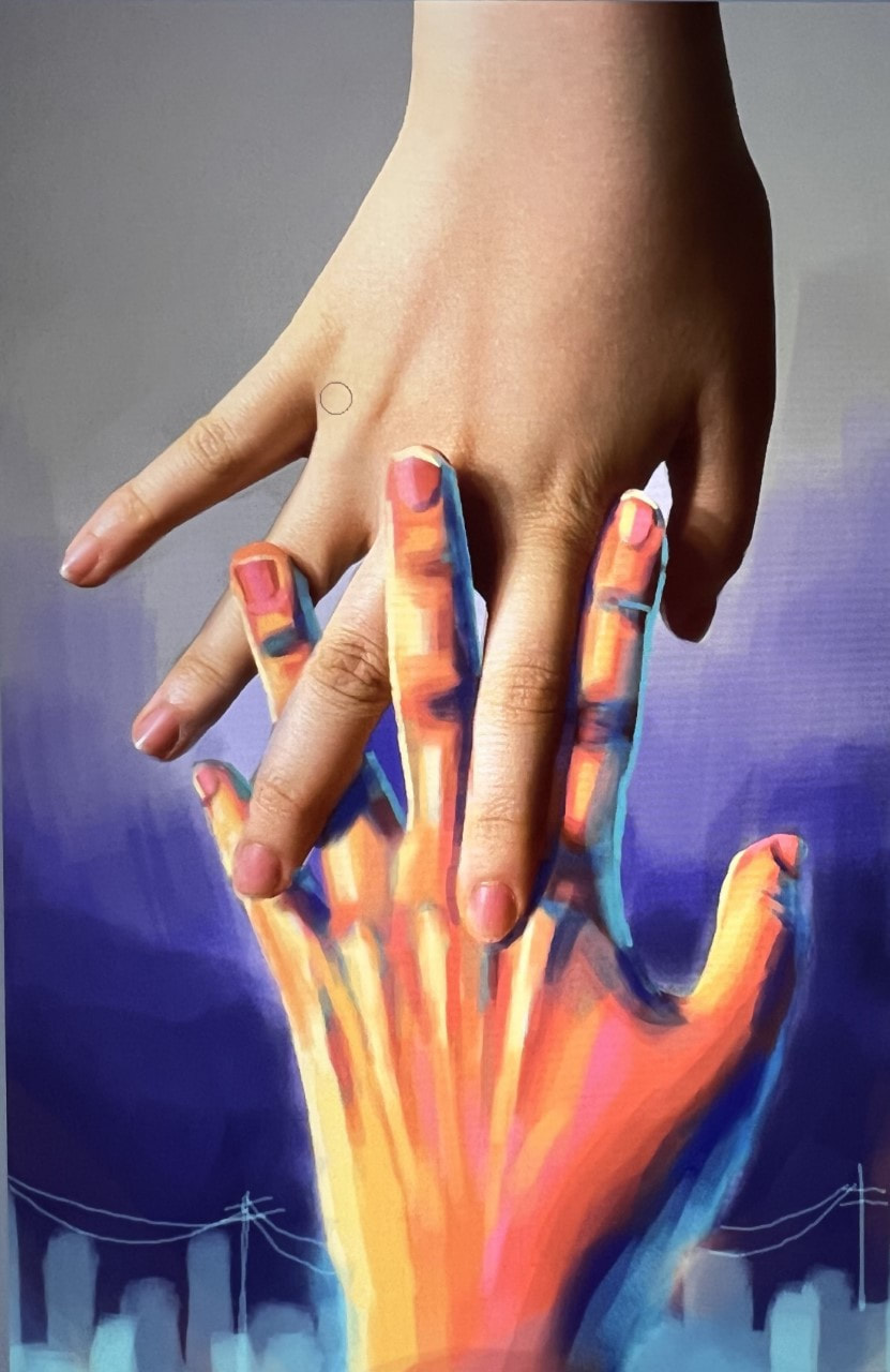
Size: 16 X 9 Medium: Photography, digital software Sketch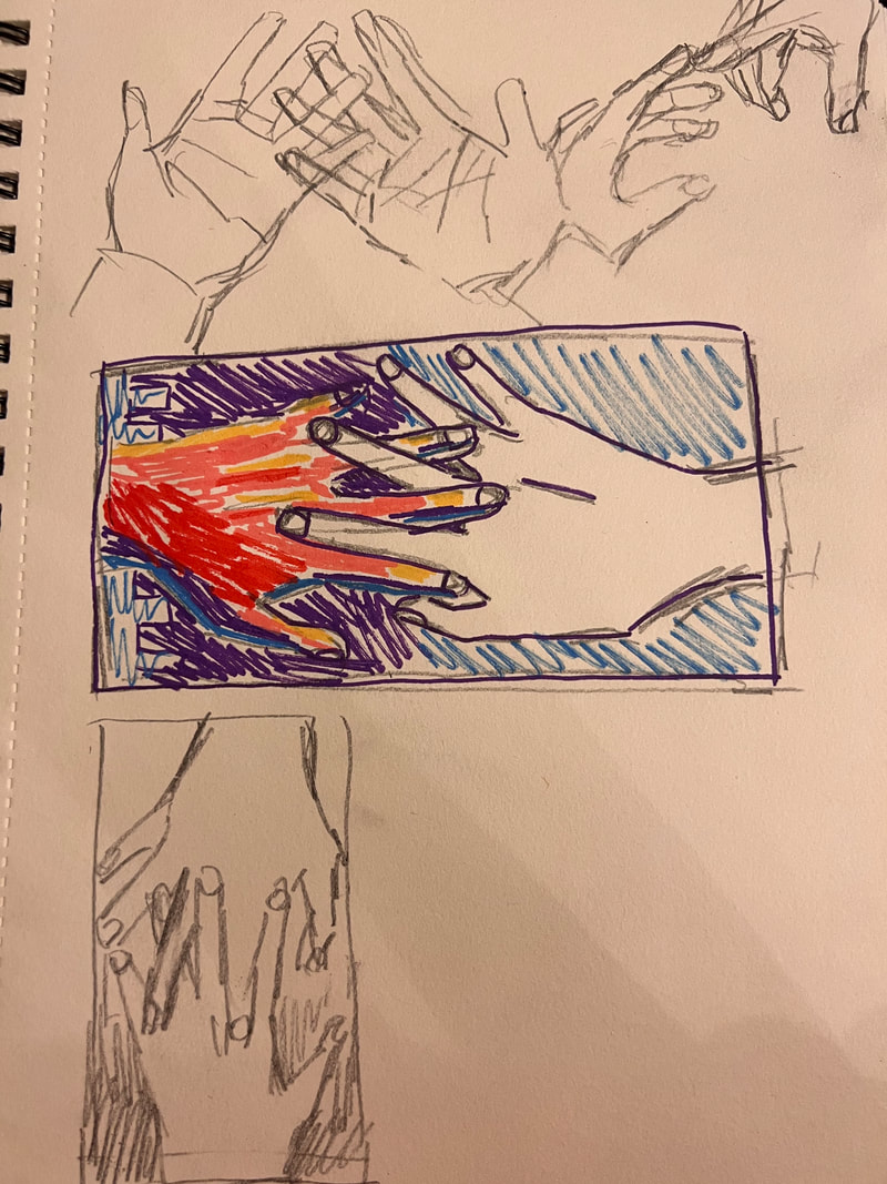 Progress
Final Reflection1) Describe your investigation of materials? How do the materials you chose relate to or effectively communicate the idea behind your work?
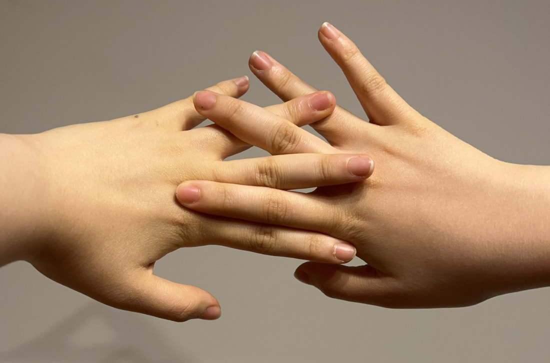
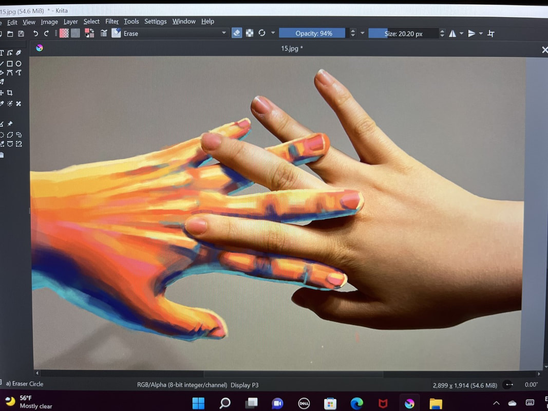
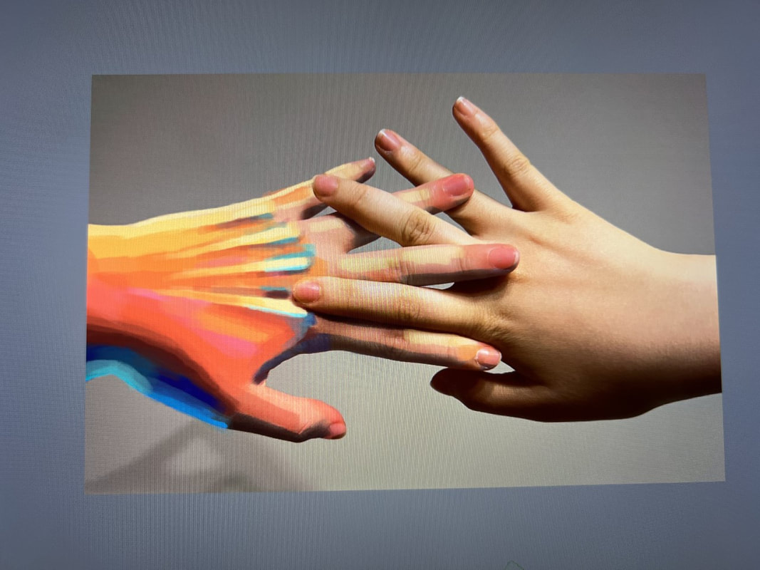
I tried something different this time and went with photography and digital art, two mediums I hardly ever use. I only went over one hand with the digital paint, which established the difference between the two hands. Since this piece is based off of the difference and similarity between the two hands, I think the medium accomplishes the meaning really well. 2)Identify the purpose, meaning, or overarching idea of the work of art. As the final piece in this portfolio, this painting serves as the nice bow that wraps everything together. This painted-over hand represents the hands I've been painting throughout this piece, while the plain hand is just my own. The way these two interact symbolizes the connection between one's inner and outer self. It shows that, though hands can represent different things (as shown in my portfolio), all these things are reflective of an individual. 3) How did practice and revision guide your end product? Though I knew I wanted to do something with photography and a little bit of paint, at first I had no idea how to go about it. I was thinking of straight up taking a photo of my hands with one of them covered in acrylic paint, but then I searched it up and it turns out that prolonged paint contact is not good (seems obvious now lol). So then I was like, what if I wear a glove on my hand and paint on that instead? Sadly, though, gloves are not made skin-tight. So digital painting it was. Not going to lie, figuring everything out was very hard. I had to learn how to use the digital software, for one, but I eventually got into a groove. Painting digitally is lowkey satisfying. 4) Describe your process when creating this work. I took a picture and imported it into Krita, a free digital software for the PC (i think). Then, I used this fat brush to layer over one of the hands. I made the highlights yellow, and the shadows deep blue. I also added a little teal backlight. Originally, I painted the piece horizontally (as you can see in my progress photos), but I realized that it looked better vertical, so I flipped it. It kind of looks like the hand is rising this way! I also added little buildings in the back to fill up some extra space--I colored in the background to make these patterns stand out. Size: 8 X 10 Medium: Oil paint on canvas Sketch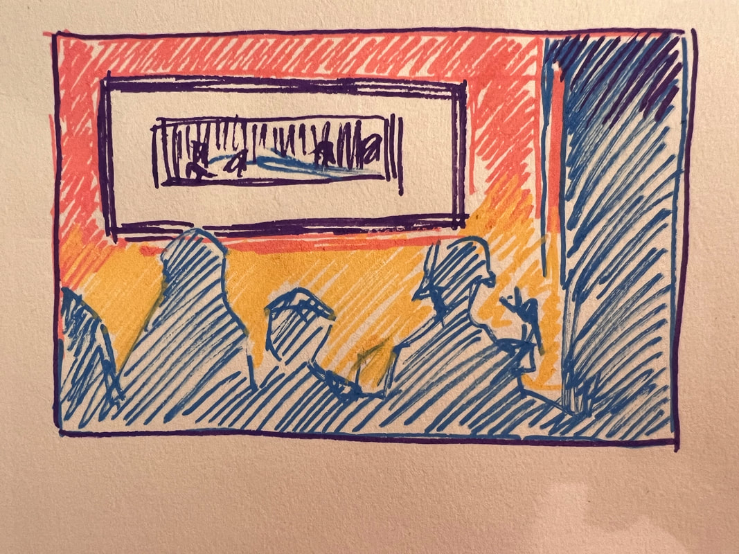 Progress
Final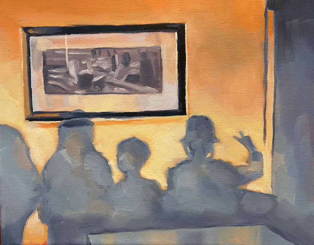 Reflection1) Describe your investigation of materials? How do the materials you chose relate to or effectively communicate the idea behind your work?
I used oil paint for this painting to explore the soft, nostalgic feeling that can be evoked through contrasting colors. Personally, I mostly chose to use oils because I thought I could paint faster with them, although I do think watercolors would be more fitting for this piece. However, I do think that the softness of the oil paint also accomplishes a similar vibe. 2)Identify the purpose, meaning, or overarching idea of the work of art. I kind of stretched the meaning of my theme with this piece, since hands aren't really the centerpiece of the painting and I'm only throwing up a peace sign. I wanted to show hands not only in an "action" sense or "figurative" sense, but also in an emotive one. Bc peace signs are very casual and common, I decided it was the perfect way to represent this. I also wanted to represent important factors of life in this portfolio, so I focused on a very important part of my own life--family. I thought this idea was pretty cute! 3) How did practice and revision guide your end product? I kind of jumped straight into this piece because I have limited time to practice beforehand. Since I have been painting with oils a lot recently, I didn't have any trouble and could start working on this painting right away. I did do a brief sketch of the piece beforehand to visualize the colors and composition, but tbh that was all. 4) Describe your process when creating this work. It looked massively weird when I only had the orange paint on the canvas, but it started looking a lot better after I added the blue shadows. Unlike the reference photo, I made the shadows a lot more opaque to emphasize the contrast. I also used a large, bright brush to make the shapes look a little geometric. Overall, I think the painting turned out well, if not a little underwhelming. Size: 11 X 14 Medium: Oil paint on canvas Sketch / Composition
In Progress
Final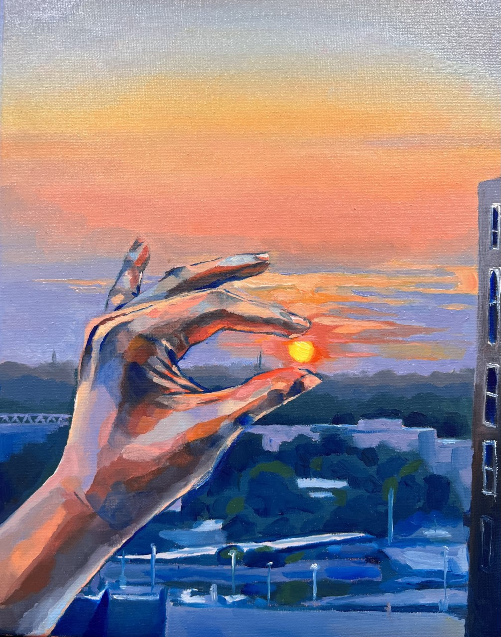 Reflection1) Describe your investigation of materials? How do the materials you chose relate to or effectively communicate the idea behind your work?
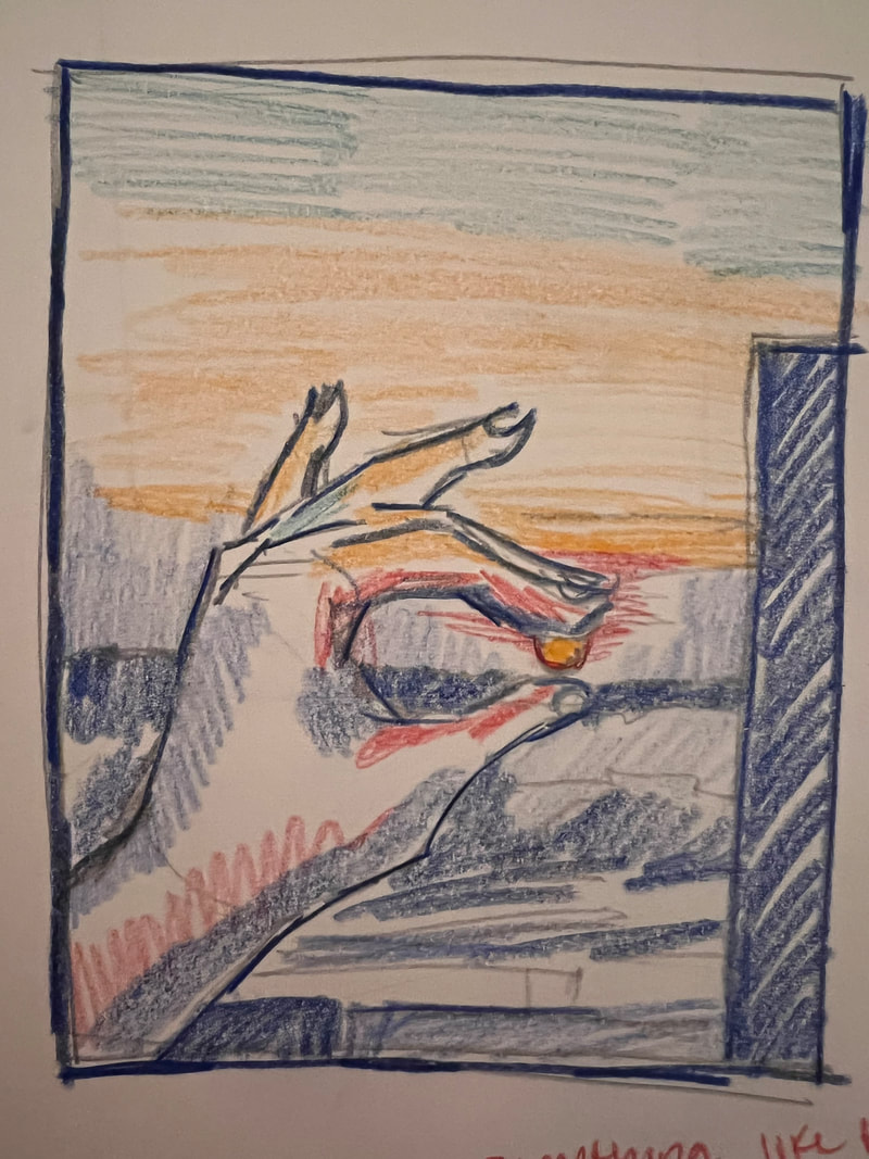
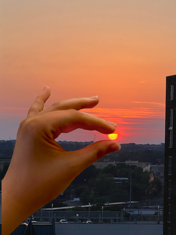
In this painting, I decided to use oil paint to convey the dreamlike, calm atmosphere. I tried switching my usual flat brush for one with a rounded tip to make the background look softer and more welcoming. Since I was aiming for the piece to look "inspirational," these materials helped elevate that impression. 2)Identify the purpose, meaning, or overarching idea of the work of art. I'm trying to make my portfolio end on a positive note, so that the judges have a good impression of me in the end haha. So, I'm going to take a swerve from deep, dark paintings and start painting inspirational ones instead. The gist of the painting is really simple--I'm just taking a normal thing people do, miming holding the Sun in between their fingers in photographs, and conveying meaning through it. The Sun in this painting is a symbol for dreams and goals. Even though it's really far away (approx. 93 million miles, which is also the title of this piece haha) you can still grasp it in your hands. I assigned the literal action being performed with a metaphorical meaning. 3)How did practice and revision guide your end product? I took the landscape photograph just on a whim, and thought that it would be a good idea to paint it because the sun cuts quite an imposing figure. But there was no way I could include it in my portfolio, since it didn't have any hands in it; but then I realized I could just take a separate photo of my hand and merge them together. Afterwards, I sketched out a quick draft just to make sure the hand didn't look too out of place. 4) Describe your process when creating this work. I wanted to make the sun stand out a lot in this piece. Thus, I made sure it was the only color to come straight out of the paint tube, whereas every other color is greyed down somewhat. In addition, to make the hand and background look properly merged, I used the colors I mixed for the background in the hands. Though, to be honest, this did kind of backfire, since the hand looks nowhere near realistic. Size: 8 X 10 Material: Oil paint on canvas Sketches In Progress
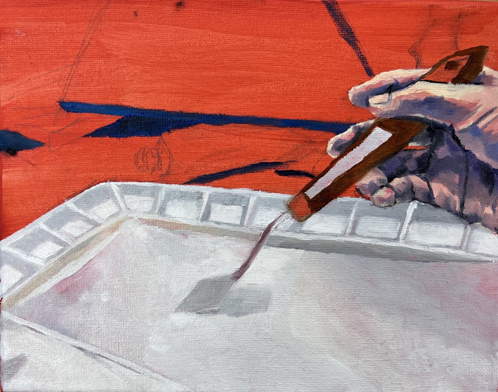
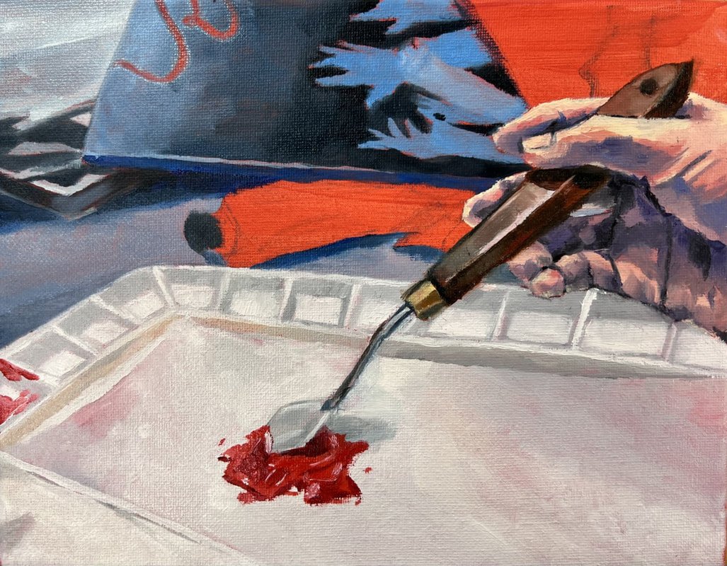
Final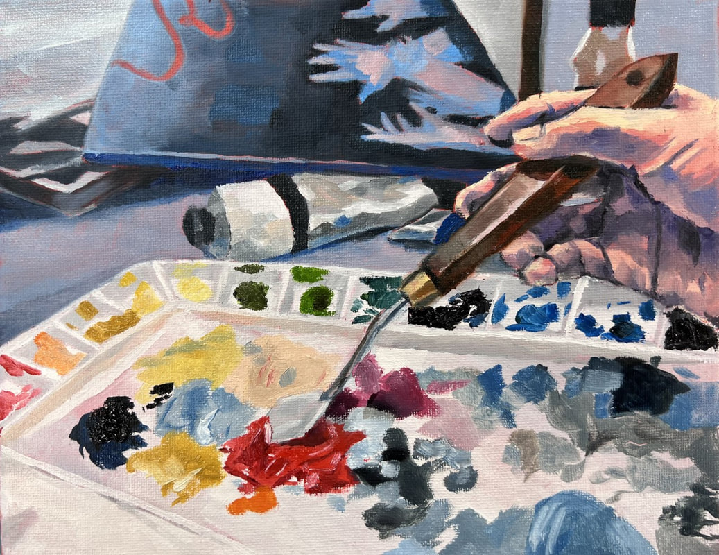 Reflection1) Describe your investigation of materials? How do the materials you chose relate to or effectively communicate the idea behind your work?
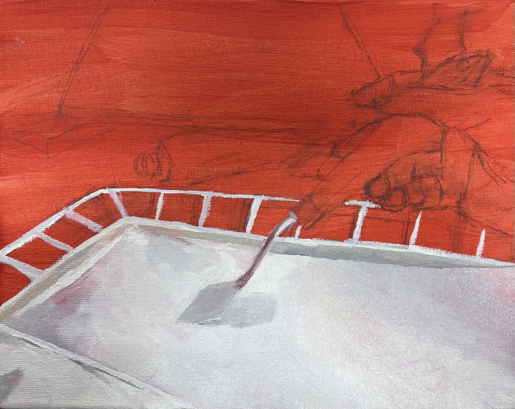
Since the reference photo is of me mixing oil paints, I thought it would be cute if I also painted the painting with oil paints. It gives the paint that lifelike feeling because, well, it is paint. Just thought it would make it easier on myself, so I wouldn't have to worry about making an oil texture with watercolors or something haha. 2)Identify the purpose, meaning, or overarching idea of the work of art. As one of the last pieces in my portfolio, I wanted to focus on the concept of how hands can affect individuals, through hobbies and the sort. Since my biggest hobby is painting, I decided to focus on how hands play a role in my passion. And it was fun painting me painting! 3)How did practice and revision guide your end product? I began by sketching out a brief idea of what I wanted to paint, then I took a reference picture incorporating all the elements to include (such as the previous painting in the background, palette knife, etc.). It was actually kind of hard to fit everything in frame, but it worked out somewhat. I decided later on that I wanted to include some more elements since the composition was looking a little empty, so I took separate photos of some tubes of paint and a Liquin container and used my great intelligence to paint them in. 4) Describe your process when creating this work. First, I built up the bottom layer of the painting (like the white palette and blue tablecloth). I only began painting the paints once I was sure this bottom layer was fully dried. I also tried making the skin tones more realistic in the hands this time, a departure from my usual exaggerating of colors and making the hands really, really blue (I used purple this time). I tried mimicking the texture of the paints in the actual palette in the painted palette. Some of the paints looked clumpy, so I added fat globs of paint in those areas specifically. There were also thin patches of paints smeared all over the palette in the reference, so I recreated that texture by adding liquin to my medium and spreading it over the canvas. One thing I don't like about the final product is that it looks so grainy for some reason. My application wasn't smooth, so you can see the texture of the canvas showing through the paint. When painting, I remember my paint was super dry and crusty, but I didn't bother to get new paints since I didn't think it was that important. Well, now I know it's important...P.S.A. to keep your oil paints nice and moist. Size: 11 X 14 (approximately) Medium: Graphite, color pencil, ink, alcohol marker, oil paint 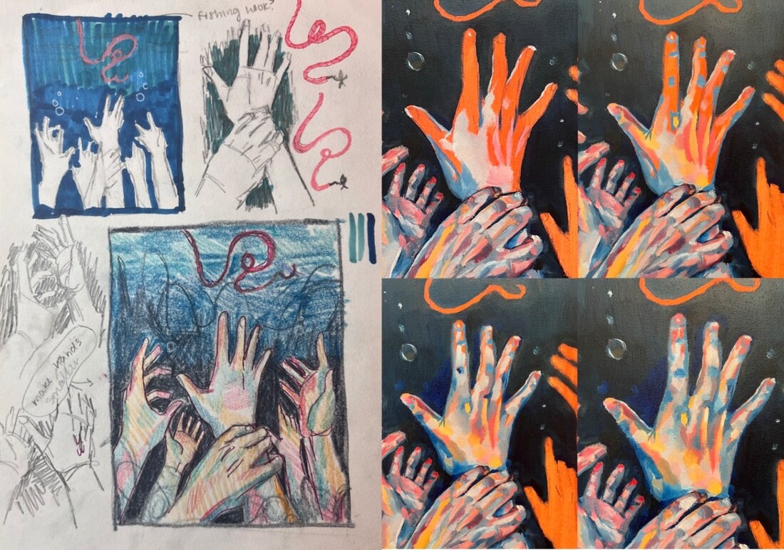 In this "piece," I've combined my sketching / brainstorming process with my painting process. On the left, the way I came up with my idea is shown--taking individual hand poses and merging them together. You can also see how I tried fiddling with the position of the fishing line. On the right, you can see the way I built up the colors in the hands to create a single final product. I began with mid tones, then laid down the intense highlights and shadows, and lastly created transition tones in between.
Size: 9 X 24 (approximately) Medium: Graphite, ink, color pencil, alcohol marker 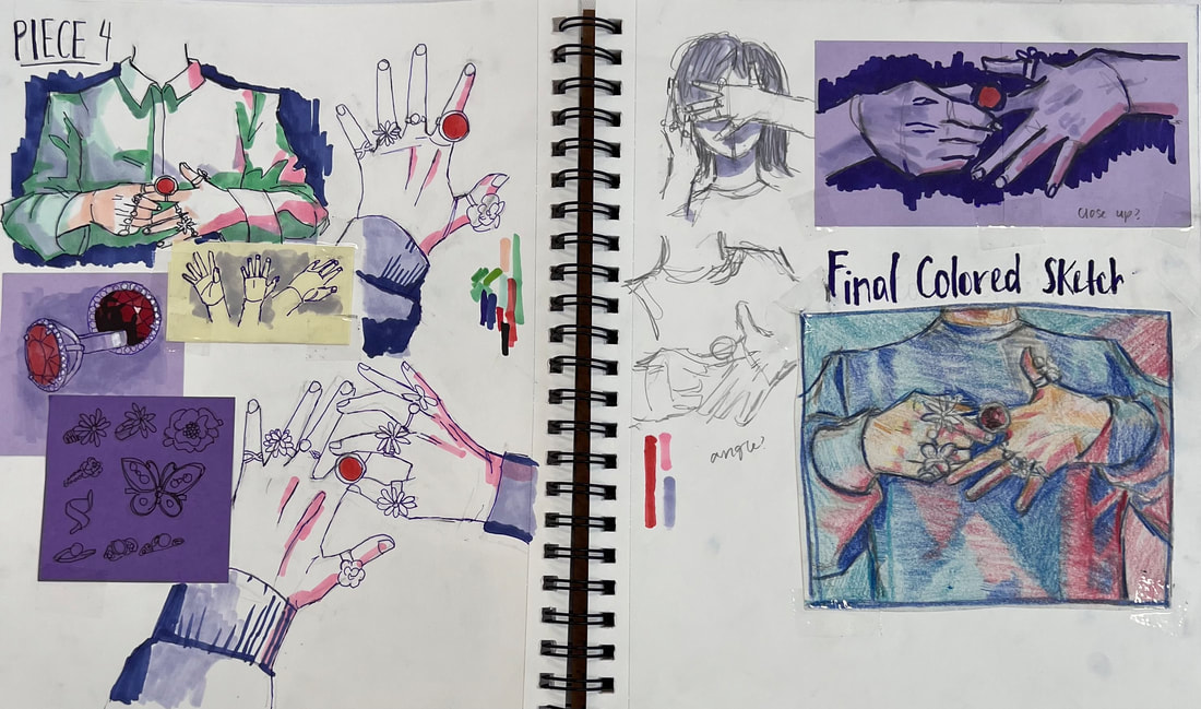 You guessed it--I couldn't finish all 15 pieces in my portfolio, so I added this sketch in instead. This sketch shows my thinking / brainstorming / composition while creating a painting. First, I draw out various ideas and positioning; for example, I specifically focused on whether or not I should also include the subject's torso in the background. I also did some close ups on the rings I wanted to include in the painting. Lastly, I went in with color to test out which variations looked the best and completed my color sketch.
Size: 11 X 14 Material: Oil paint on canvas Sketches Process
close-up view of painting process Final
Reflection1) Describe your investigation of materials? How do the materials you chose relate to or effectively communicate the idea behind your work?
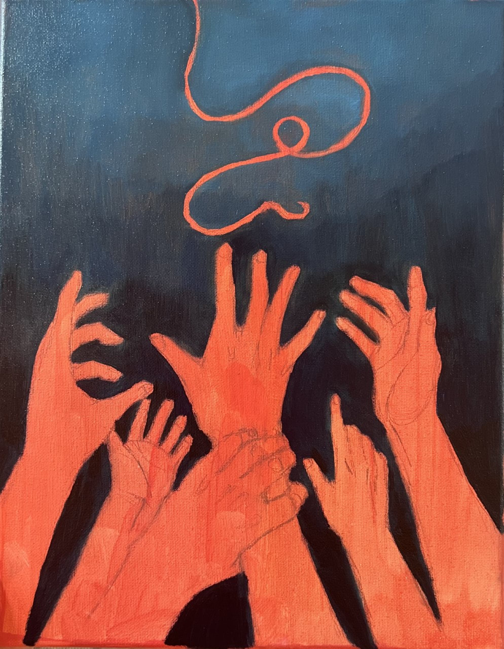
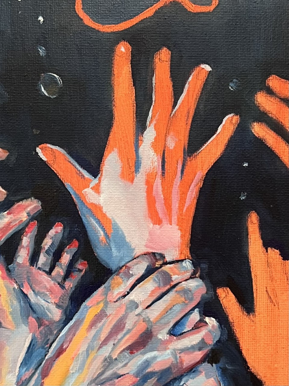
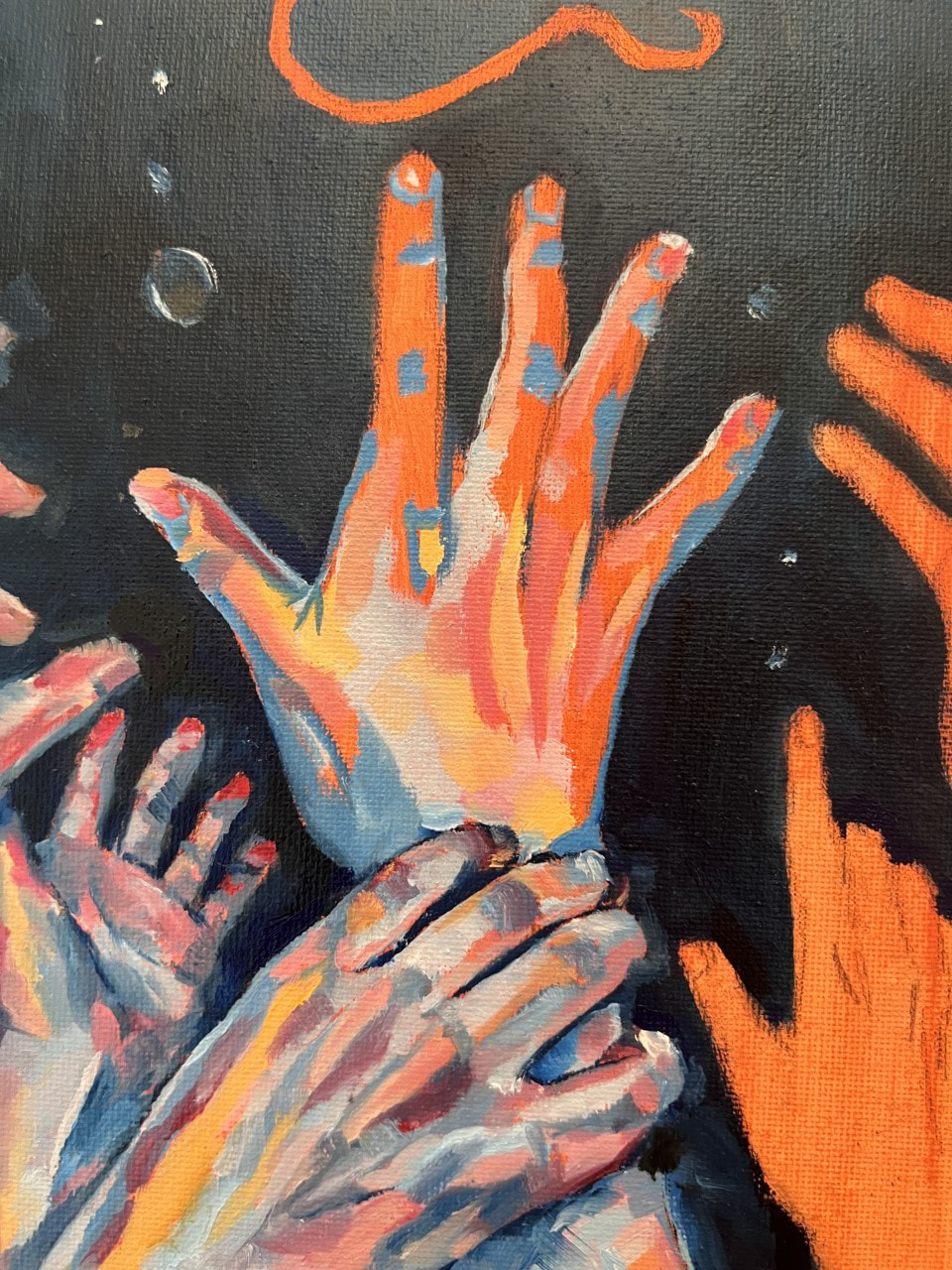
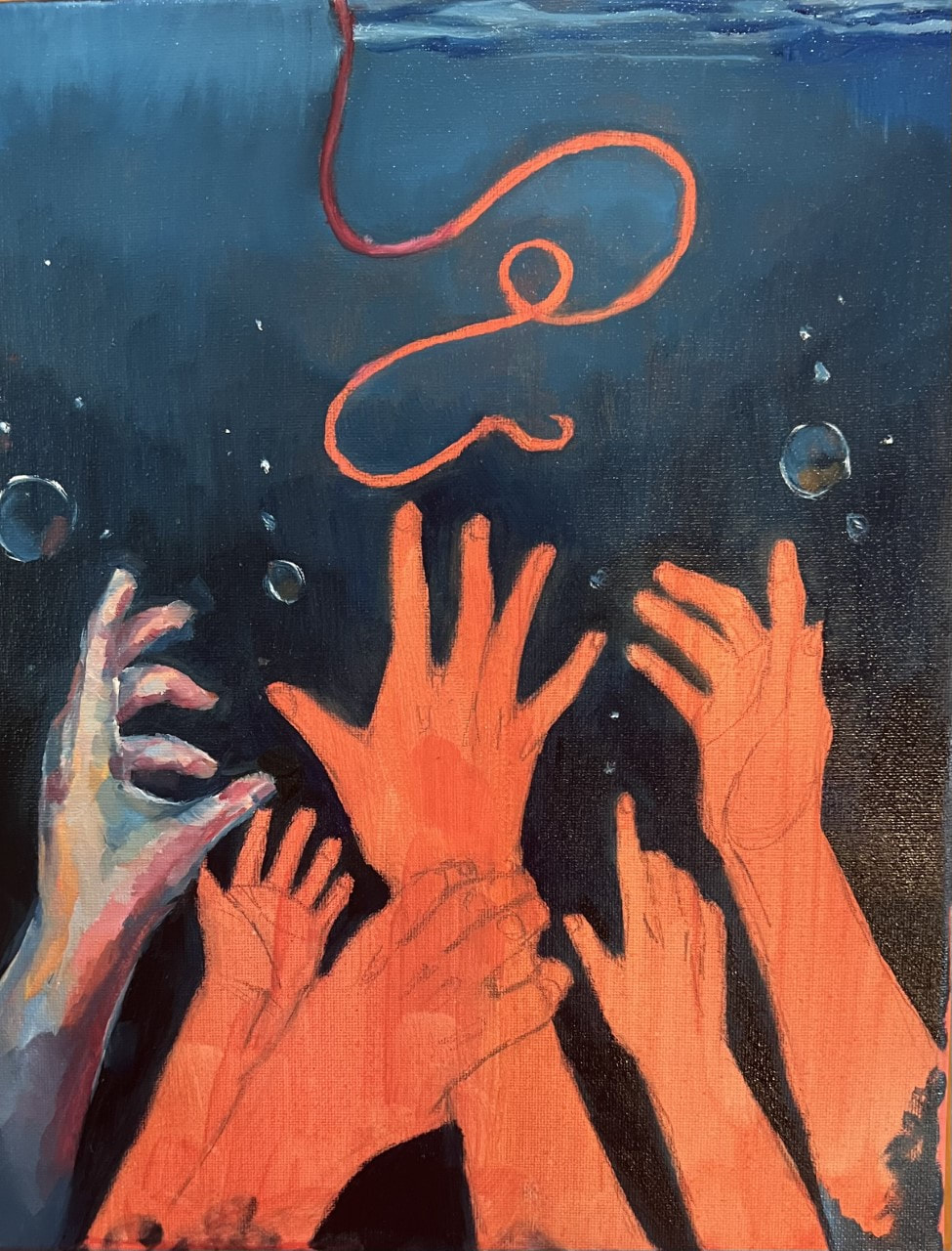
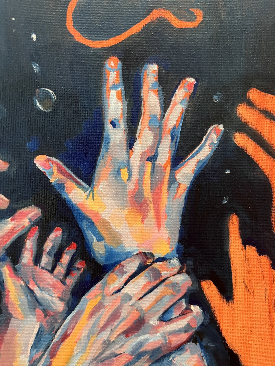
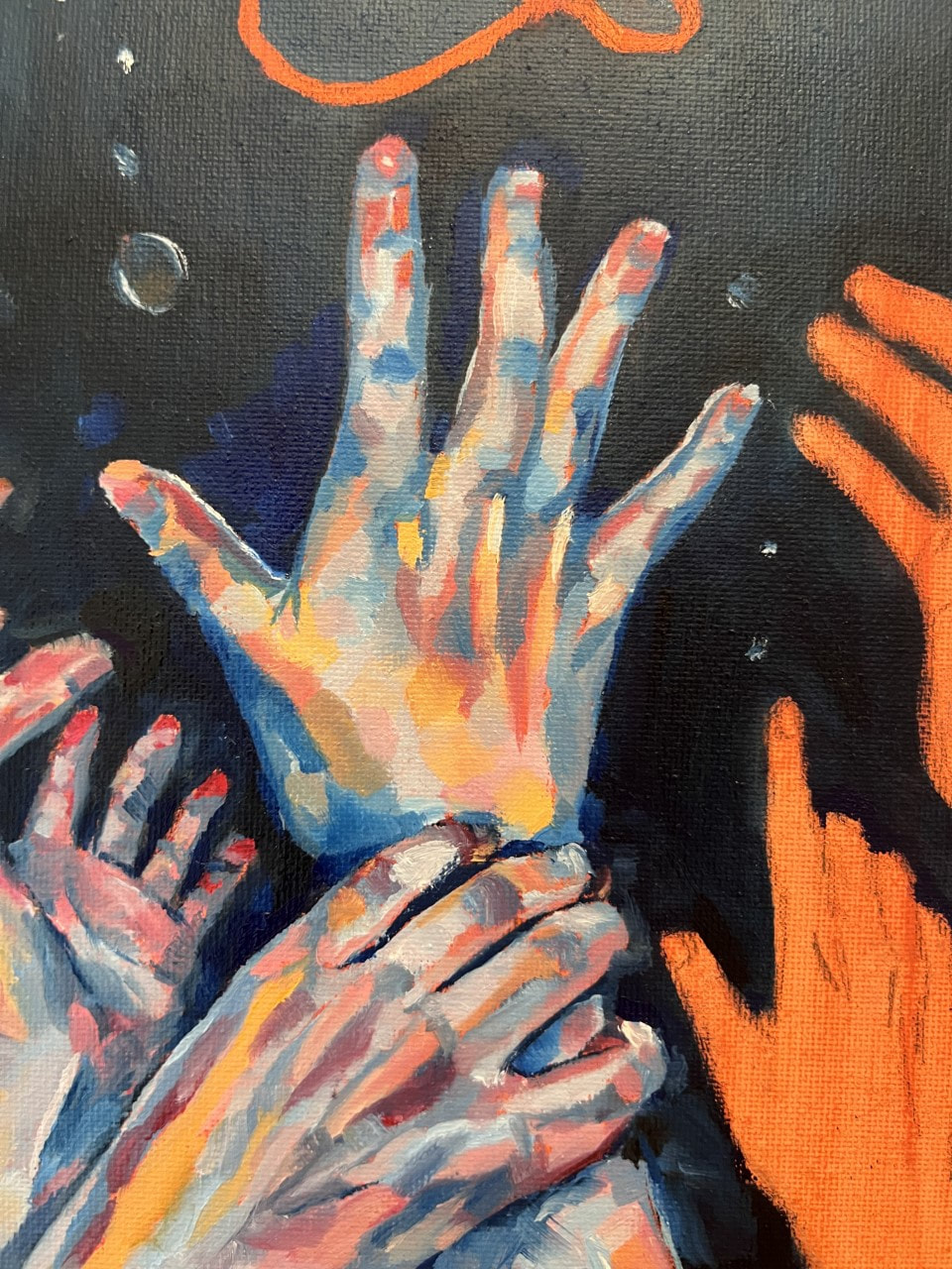
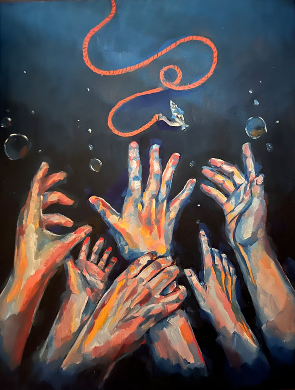
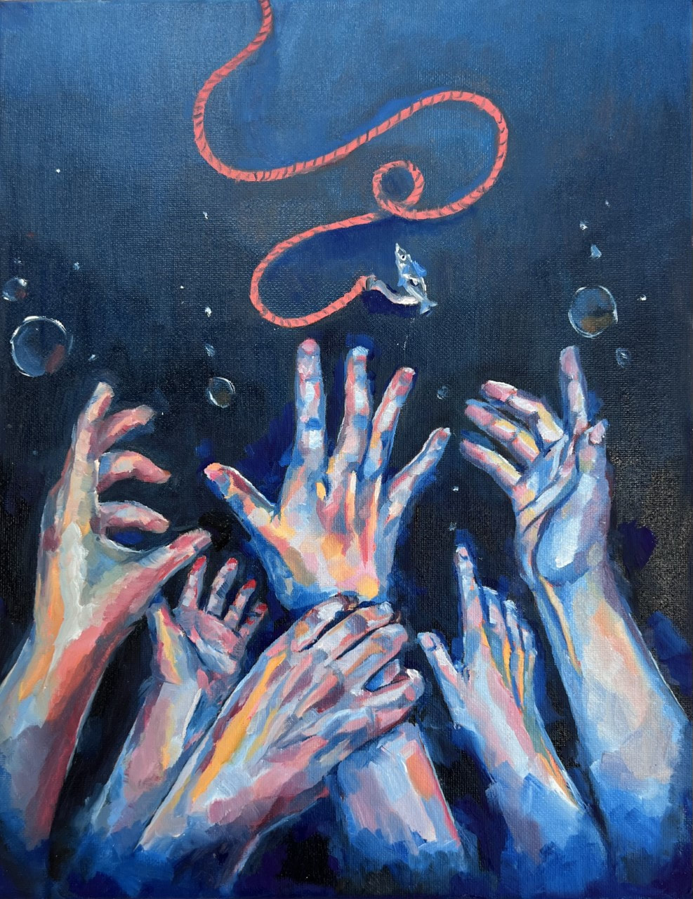
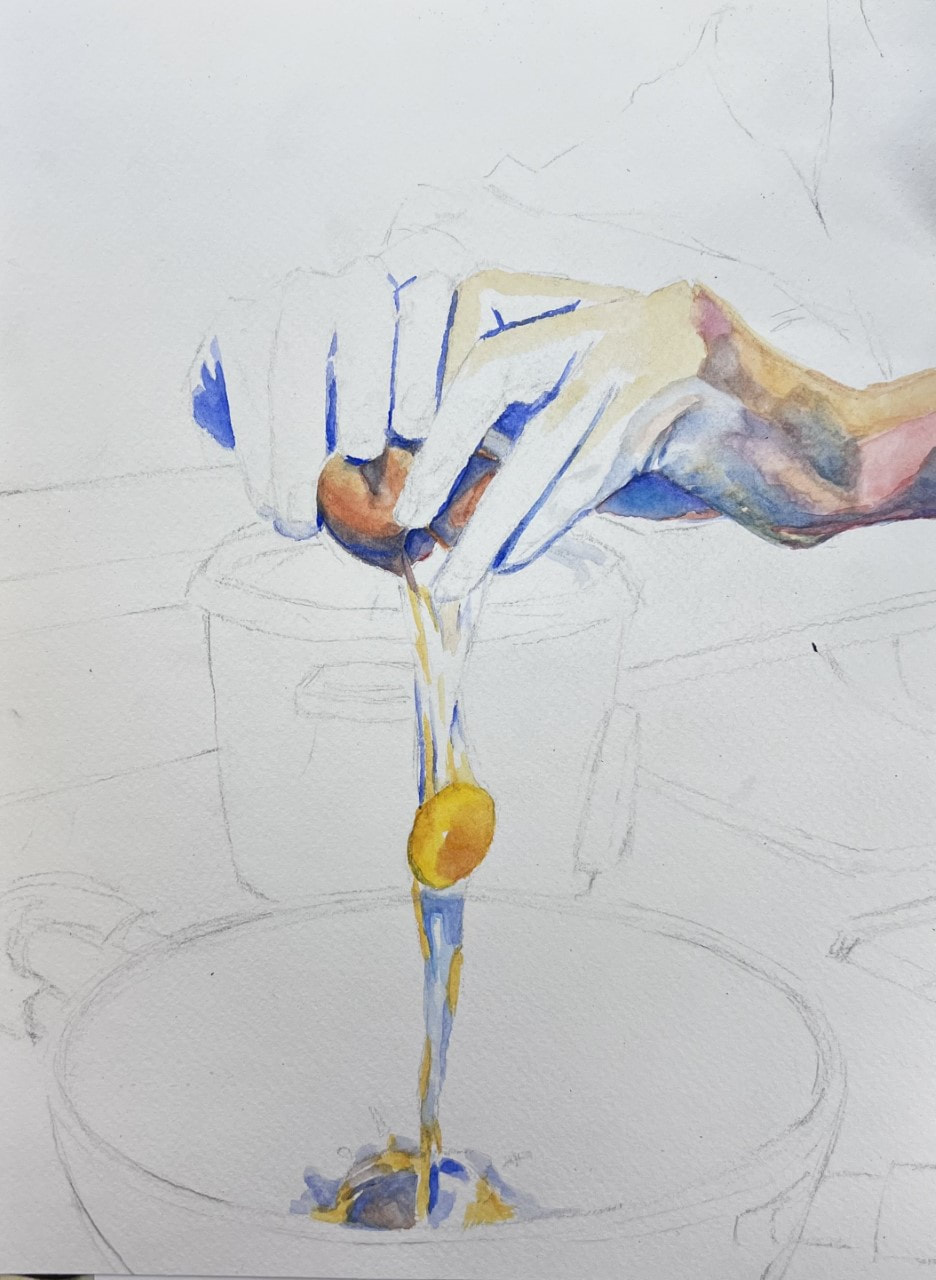
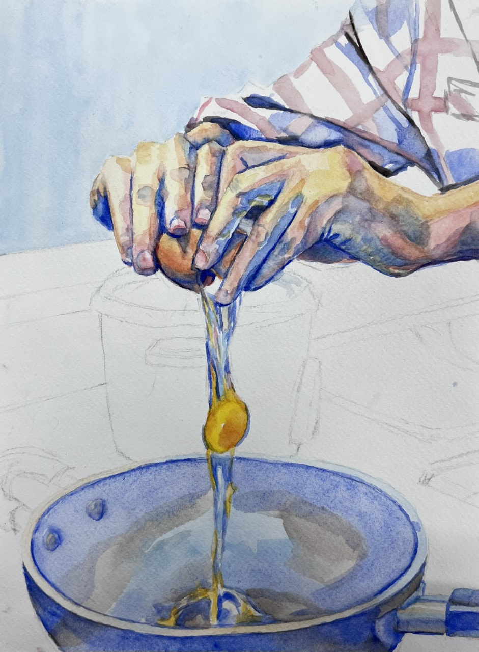
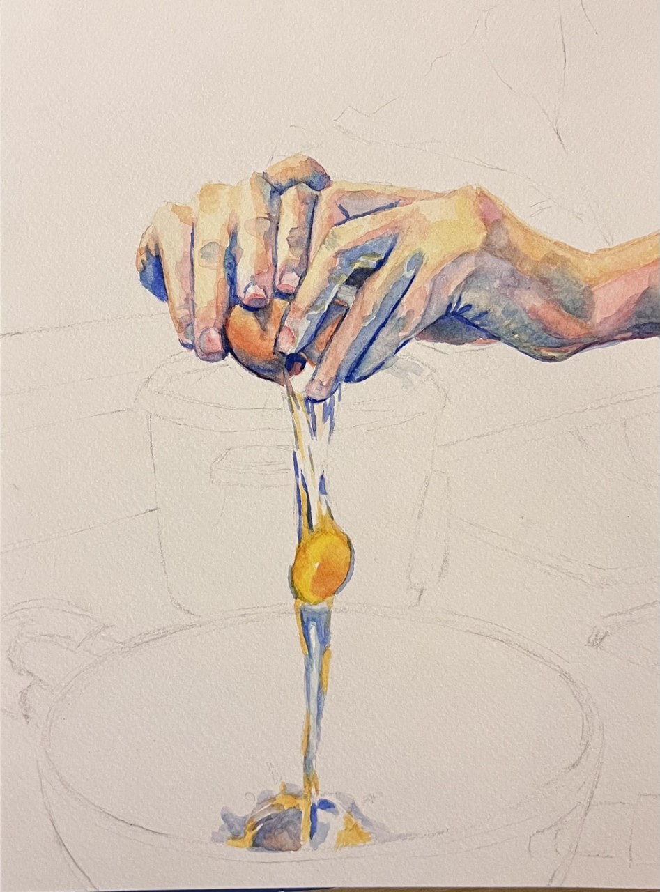
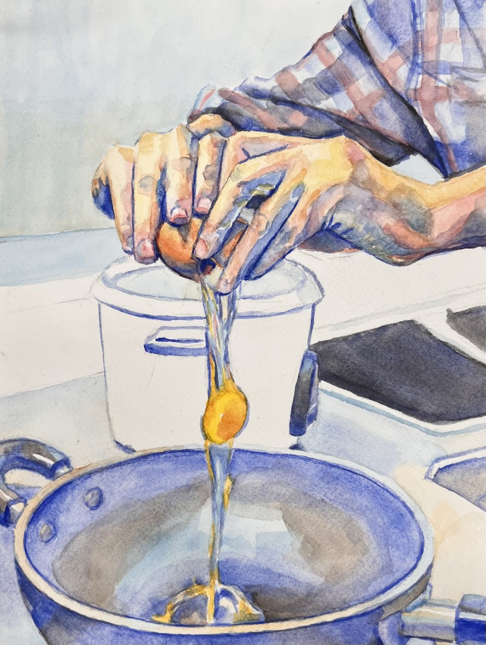
I used oil paint on canvas for this painting, which sort of fits the vibe because it's thick and viscous, like water filling up one's lungs. To emphasize this feeling, I tried a new method of layering on the paint thicker--basically giving the piece more dimension. Tbh I don't think it was quite as dimensional as I was hoping it would turn out, but I guess the technique's still a work in progress haha. 2)Identify the purpose, meaning, or overarching idea of the work of art. Personally, I'm not a very competitive person. Which is also why I hate living. Just kidding, but it's true that sometimes life feels like a big competition: students compete to go to the best colleges, then the best workplaces, then the best life, etc. Truly exhausting 😴 This painting seeks to depict this race. Tons of hands desperately reach towards the bait taunting them, even pulling others down to get ahead. They're so focused on the bait and on winning that they ignore the hook on the bait that's waiting to pull them in. They play into the fisherman's game unknowingly. It's a little funny because they're trying so hard for this tiny fish, kind of symbolizing how we work hard for stuff that doesn't really matter in the end. 3)How did practice and revision guide your end product? Obviously I don't have access to six different hands--I had to improvise to complete this piece. First I sketched out about what I wanted, a few hands in different poses, all in water. Then I went ahead and took separate pictures of my hands for each pose. To merge them, I used my ~artistic interpretation~ and made the hands a lot of radioactive colors to cover for the fact that none of the pictures were taken with the same lighting. 😬 I also played with the positioning of the fishing line. Originally, I wanted a really long canvas so the line would have a more "impactful" silhouette, but I didn't have any so I just used a normal sized one. That meant I had to come up with a more complicated line position to give the top and bottom of the piece a balanced weight. 4) Describe your process when creating this work. Like I mentioned before, the main part of the piece was the layered texture and dimension given by adding more paint in parts of the piece. I did this by contrasting the textured hands with a flat background to give a pop to the hands. I also made the background a gradient to make it really seem like the hands are sinking. The brightness of the water near the bait emphasizes the idea that reaching towards the bait is like freedom from the ocean. Size: 9'' X 12'' Medium: Gouache Reference / Sketch
Progress
Final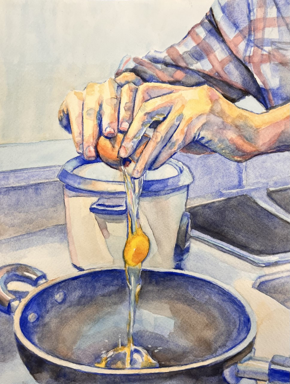 Reflection1) Describe your investigation of materials? How do the materials you chose relate to or effectively communicate the idea behind your work?
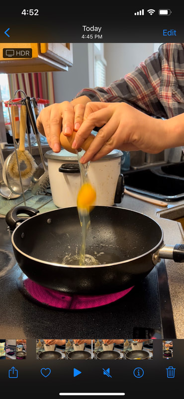
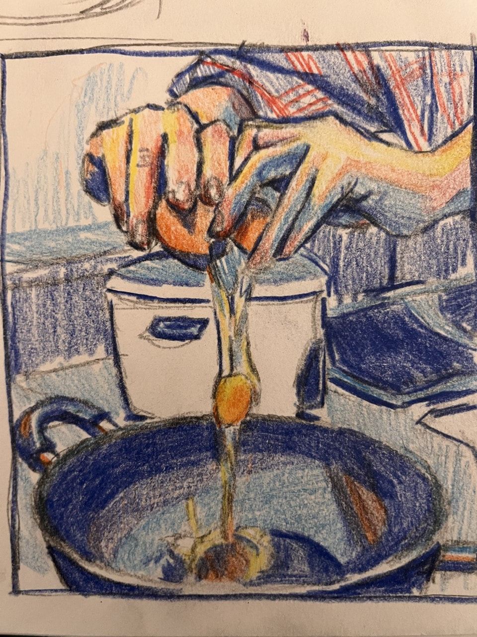
Initially I wanted to go for a watercolor, but then I remembered the pain and suffering I went through in piece 5 and used gouache instead. In the end, I can confirm, gouache was much better to work with. Gouache was definitely the right choice for this piece--it keeps the painting calm and relaxed, while still injecting a vibrant energy to it. Almost like the sun streaming through the curtains when you're drowsy in the morning! Also, it really helped render the egg nicely. IMO the egg looks very liquid and viscous at the same time, which is really a product of the paint. The medium was very versatile to work with. 2)Identify the purpose, meaning, or overarching idea of the work of art. Keep in mind that all of my pieces are out of order at the moment, but I'll likely place this piece next to #5 when submitting. To take a break from all the angst and deep metaphors of the previous paintings, this painting focuses on the mundane in life, with the hands as the centerpiece yet again. I wanted to shift focus on life's beauties instead of its strifes, because I think life is a very beautiful thing! I wanted to focus on things we take for granted, like a fresh egg in the morning on the weekends. I really love eggs, especially sunny side up. By the way I ate the egg after I got my reference, which was pretty fun. 3)How did practice and revision guide your end product? Though I've never used gouache before, I've used watercolors extensively in the past and discovered gouache is basically the same thing in use. Or maybe I just used gouache completely wrong. But the painting turned out good, so I probably did some things right! I've had the idea of something fun for a while now, since I'm not used to painting so many deep and sad things in a row. I started watching a lot of food channels and doodling food in my sketchbook, and that's when I discovered this idea. 4) Describe your process when creating this work. Like I said, I mainly used watercolor techniques to do this piece, mostly building up layers. This piece actually went super quickly somehow with this method. I wanted to bring the focus to the hands and the egg, so I solely painted those in warm, yellowish colors to bring them forward, while painting the background in blueish tones to push it back. I feel like this really brought depth to the piece. It also gives it some of that morning feel, since the blue lighting makes it seem like the sun is hitting the counters. Size: 11'' X 14'' Medium: Oil paint Brainstorming & Sketch
Progress
Final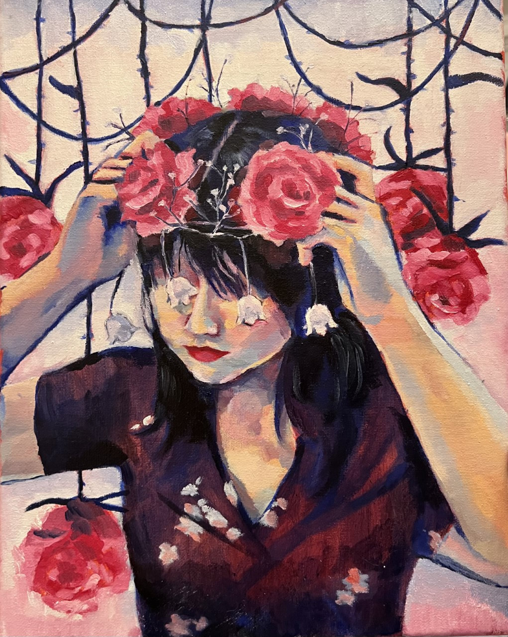 Reflection1) Describe your investigation of materials? How do the materials you chose relate to or effectively communicate the idea behind your work?
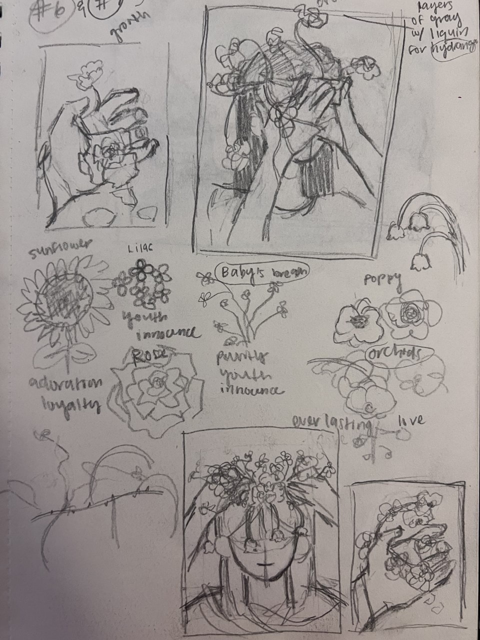
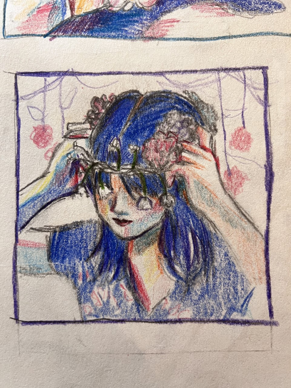
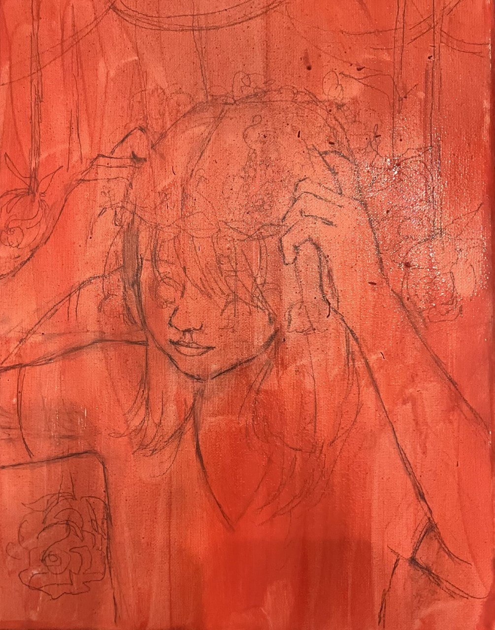
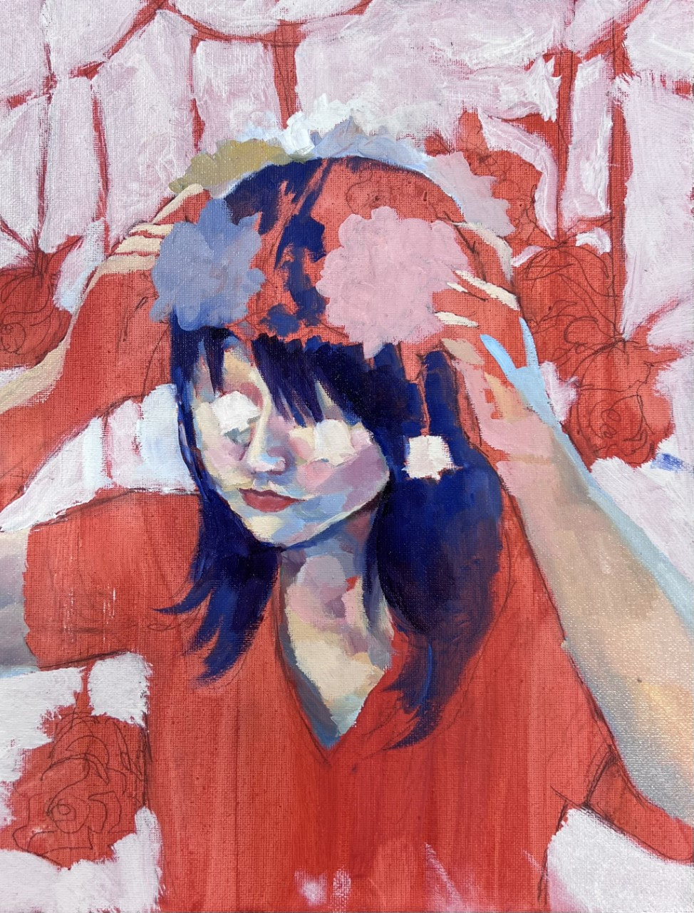
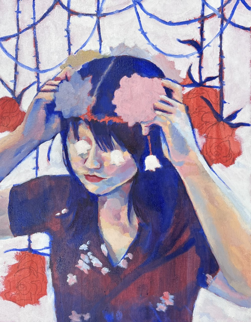
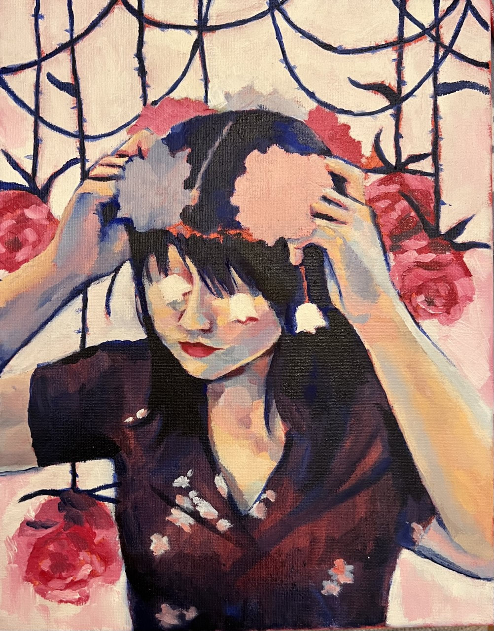
I decided to go with oil paint in order to maximize my speed and match with piece 6. Since these are dual pieces, I decided it would be best to draw connections between them visually. In addition, I think the soft impressionism of the paint really gives this piece extra impact. In this painting, I wanted to explore the softness of oil paints by drawing on common stylistic choices in Japanese paintings. The white colors interspersed throughout the piece and thin line art emulate techniques seen in famous Japanese pieces, which I used to show quiet innocence of this painting. 2)Identify the purpose, meaning, or overarching idea of the work of art. This painting, along with #6, explore dualities in human nature and how they manifest in our hands. The past piece explores the duality between life and death, whereas this one explores the duality between love and blindness. Notice that the crown of flowers has bulbs that cover the eyes. The fact the girl cannot see through the flowers shows the "blindness" aspect of the painting--and the fact that the flowers, which all have meanings relating to "pure, innocent love," cover her eyes demonstrates how love can blind someone from its downsides. The placement of the hands is a point of contention for the viewer: is she placing on the crown, or is she trying to take it off? Normally I wouldn't paint about a cheesy topic like this, but you can't have a flower related painting without love motifs! 3)How did practice and revision guide your end product? First off, I wanted to decide what flowers I wanted to include in the painting. I knew I wanted to include roses in the crown and background since I am a boss at drawing them, but it was a struggle choosing the rest. Eventually, I chose two pure white flowers, baby's breath for the branches and structure of the crown, and lily of the valley for the flowers that would hang in front of the eyes. The two share similar meanings: innocence, purity, youth. It was a struggle choosing what pose I wanted the subject to be in without being awkward. I initially wanted a frontal picture, but then I realized that #4 was also a frontal picture, so I took it from a 3/4s view to spice things up. 4) Describe your process when creating this work. I decided on a "base color" first, ultramarine blue, which I used to paint the majority of the figure. Afterwards, I stuck some colors on and saw what stuck. Since the face is majorly boring without eyes, I went for a more impressionistic look and added a lot of colors to it without blending. I think this turned out really well! Though the impact definitely lessens from afar. The white background initially looked too cool and blank, so I added a small ombre of blue to pink to blue instead. Hopefully this made it look better! Overall, I don't think this is one of my best paintings, but it's not bad! I wish it could've turned out more impressive since I wanted this to be one of my "centerpiece" paintings, but oh well--I'm just going to continue since time is really going by fast. |
AuthorMonica Jin Archives
June 2022
Categories |


 RSS Feed
