|
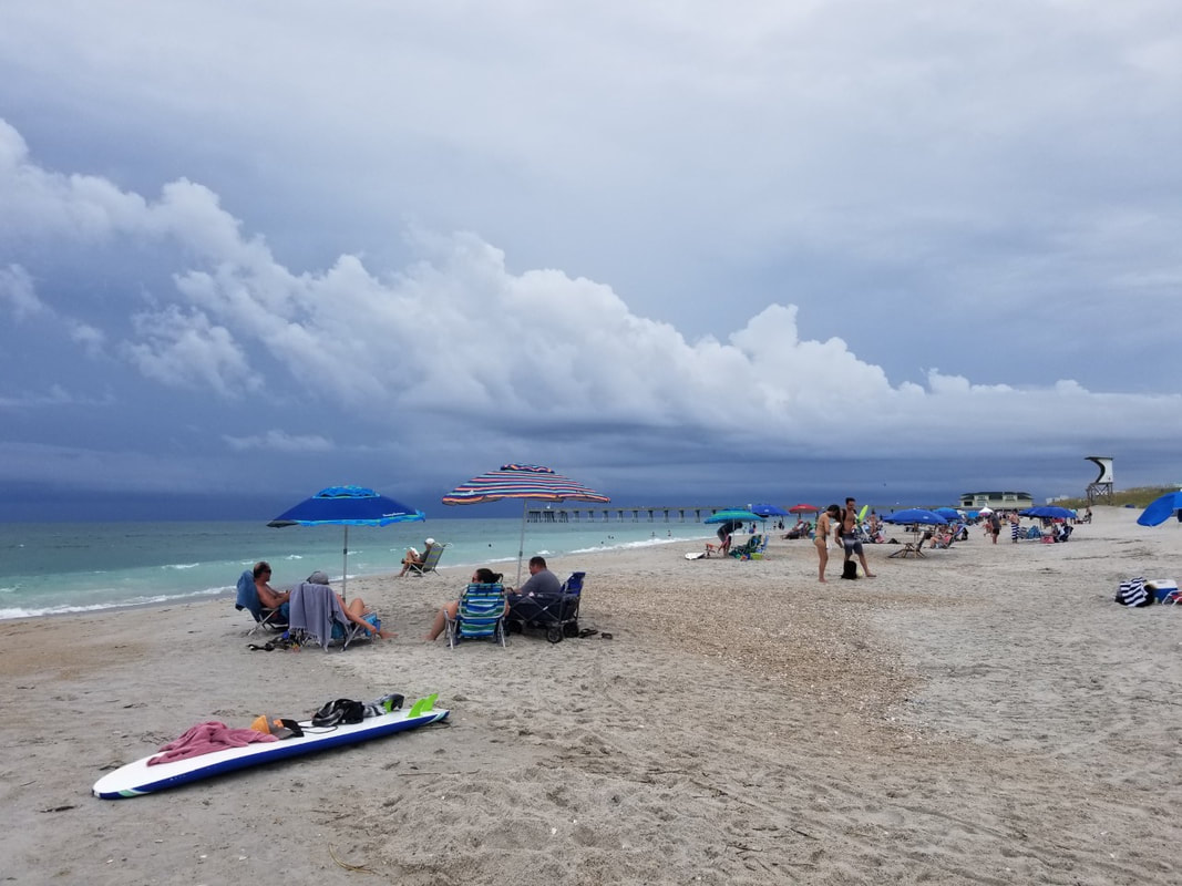
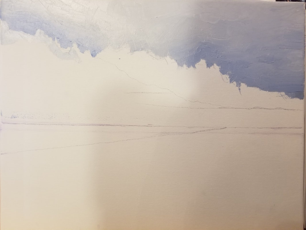
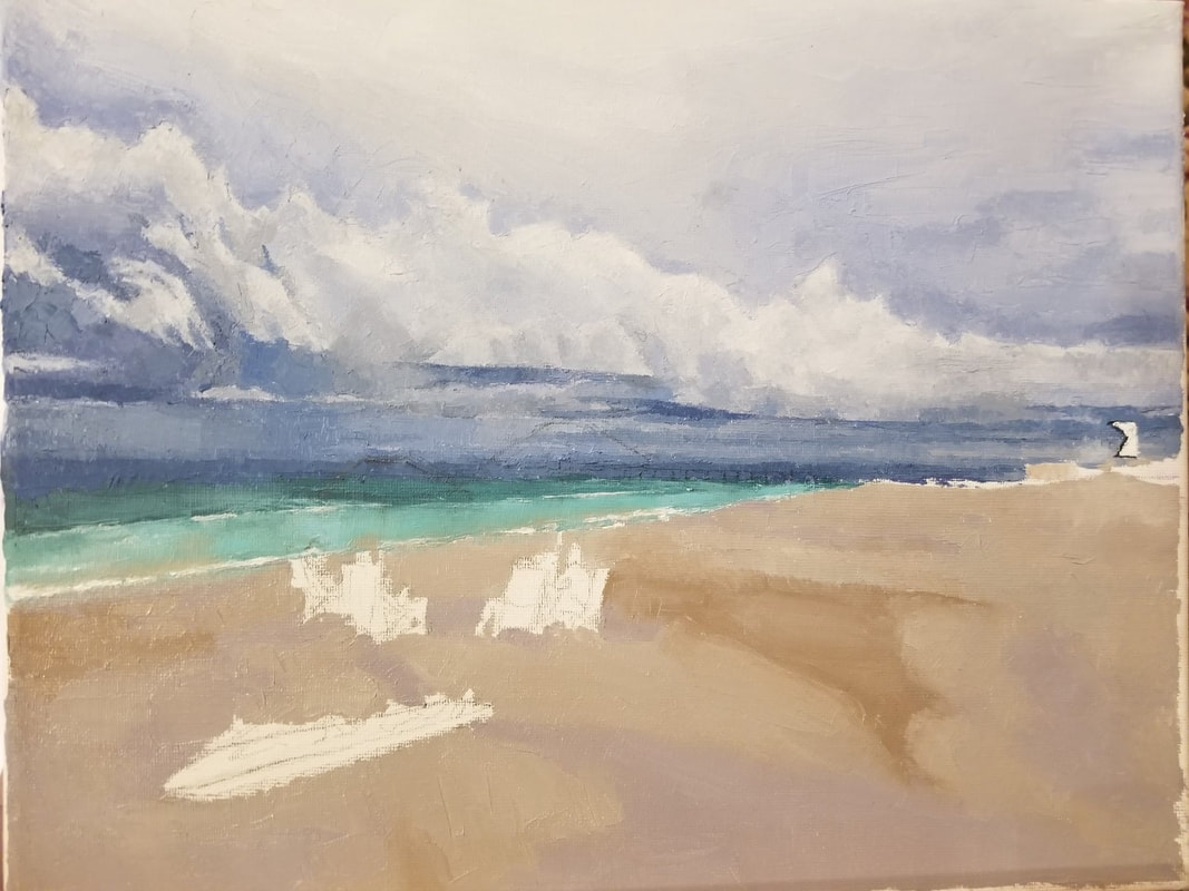
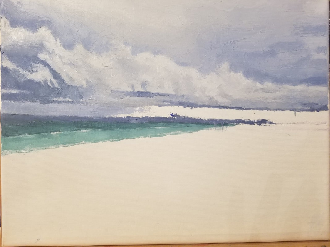
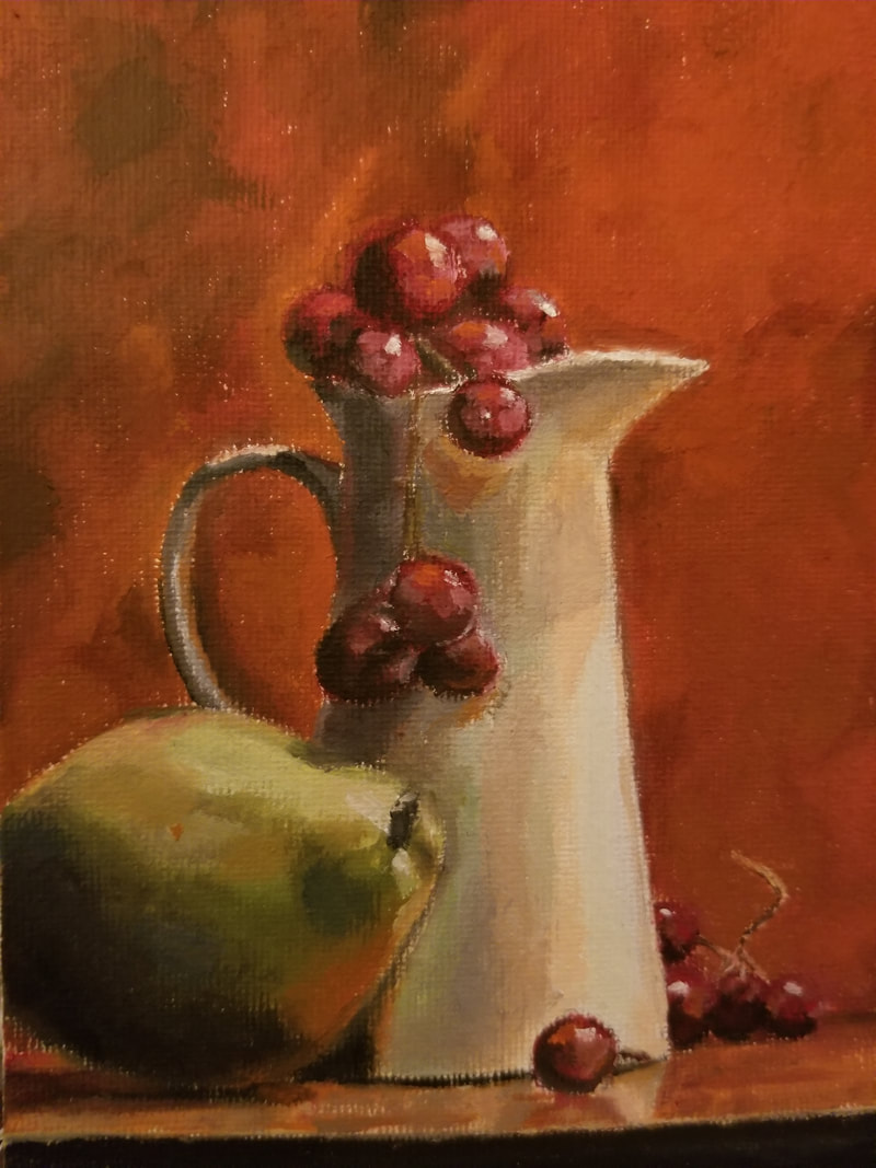
During our final Art 4 choice project, we had a variety of prompts to choose from. I decided to go with the palette knife painting, where I would paint a landscape in oil using primarily a palette knife.  Beginning - Reference and Thought ProcessI decided to choose a palette knife painting because I thought that it would be fun to use a different method of painting. Before, I had tried to paint using a palette knife, finding that applying layers felt a lot like icing cakes. I was curious about what it would feel like to paint the sky or water using this technique.
Process
After some time, I realized that much of this painting would have to be done in one sitting. The oil paint dried a lot faster than I was expecting, making the application of paint a nightmare. Unlike with brushes, the palette knife gave the paint an uneven texture that looked really nice but caused issues when trying to paint another layer on top of it. The grooves and indentations in bottom layers were hard to fill in, leading to what looked like chips in the paint. In the end, I couldn't find another remedy for this other than painting really fast.
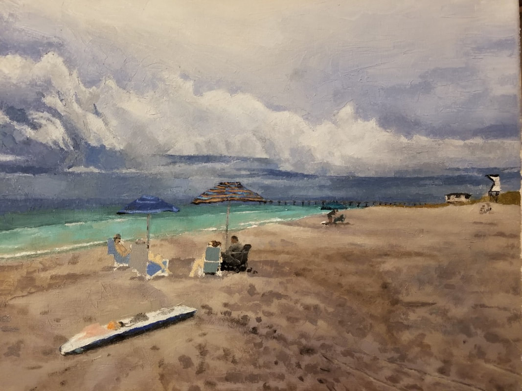
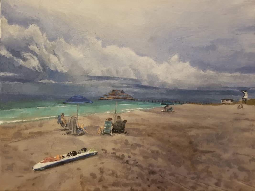
I painted the tracks in the sand and the people with a brush!  I realized that I accidently painted the sand one shade darker than what it was supposed to be, so I brushed a light glaze over it using a mixture of liquin and paint. I also decided to color the white portion at the top of the sky a sort of off-white pinkish color, to help make the atmosphere more dreamy. ReflectionI enjoyed painting this piece very much. It was very calming. I think it helped the dexterity of my application of paint as well. I love how it turned out--I think the atmosphere I was going for really came across. I would definitely consider doing another palette knife painting again some time in the future.
0 Comments
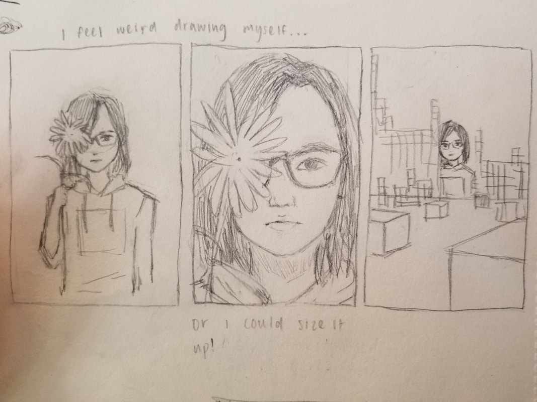
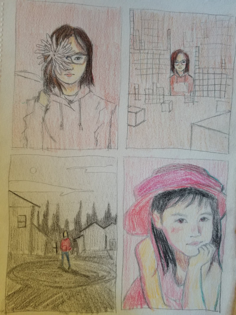
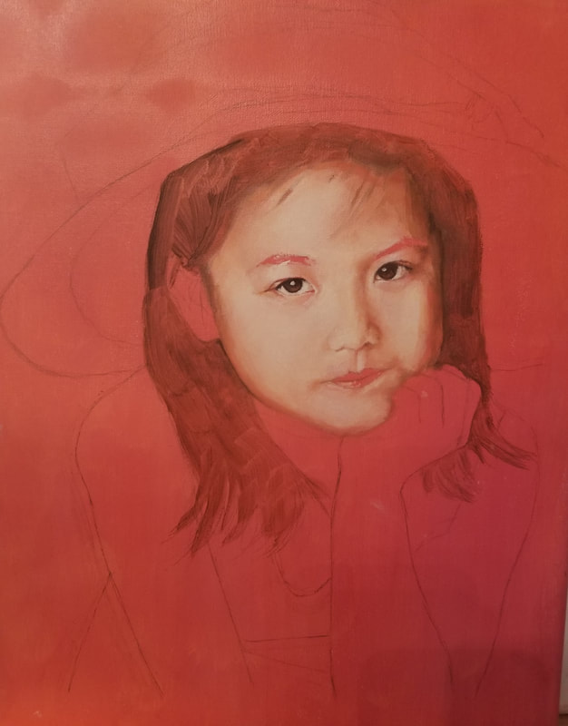
In this project, we were supposed to put a unique twist on a self portrait in either oil or acrylic paint.  Sketches and Ideas
3rd idea
I was really excited to start this project, so coming up with ideas was surprisingly easy. I thought of three overall ideas, each of which I drew three thumbnail sketches for.
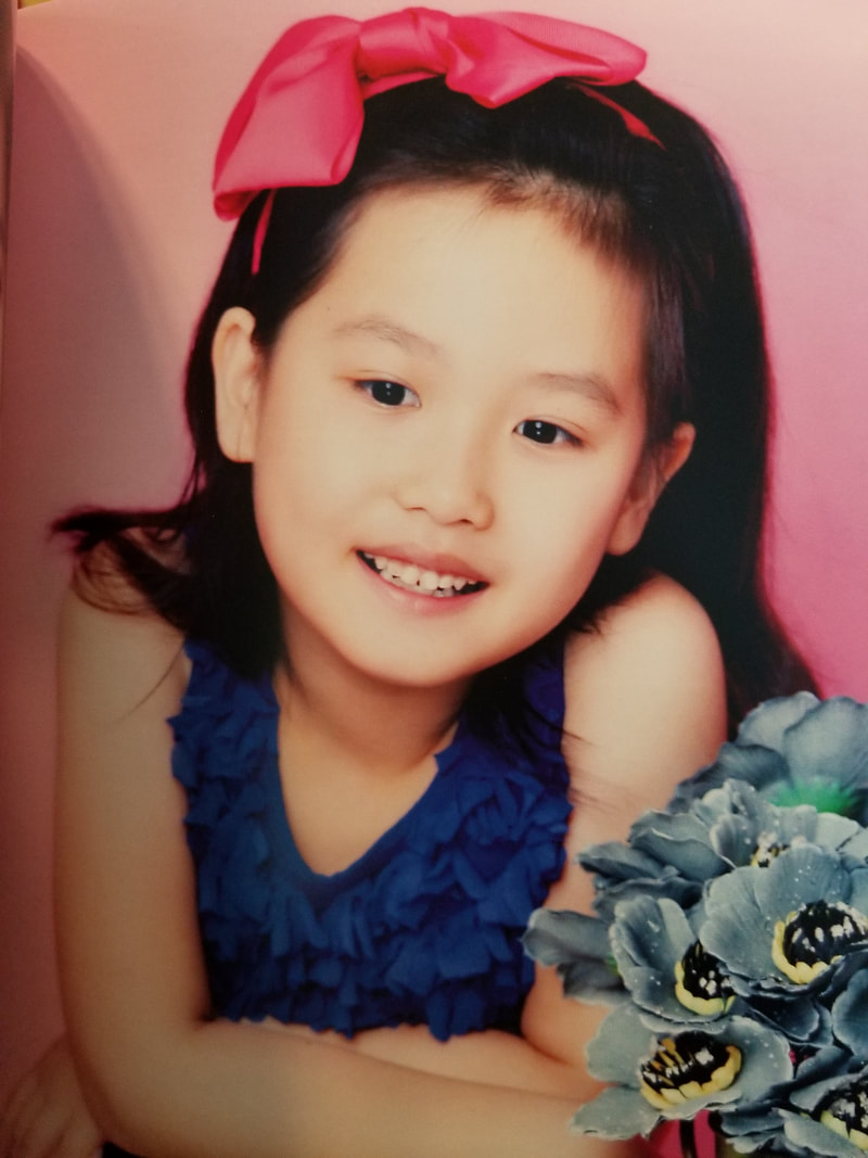
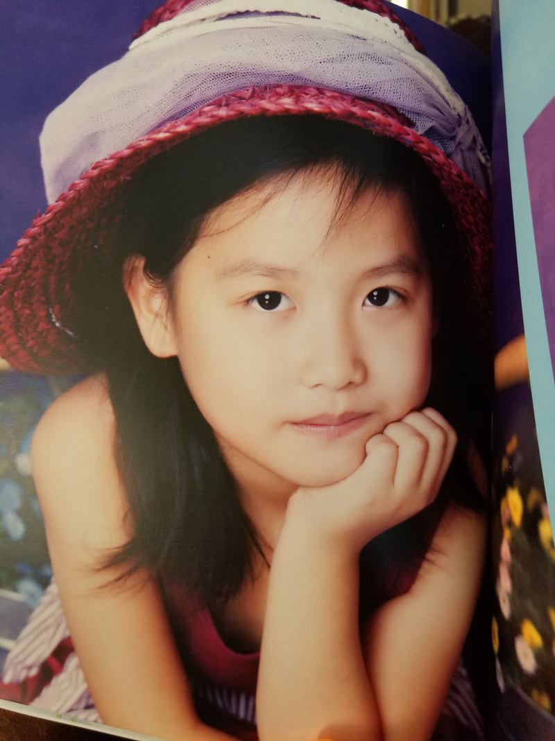
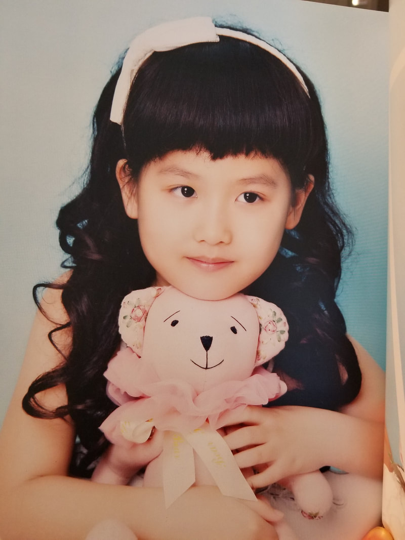
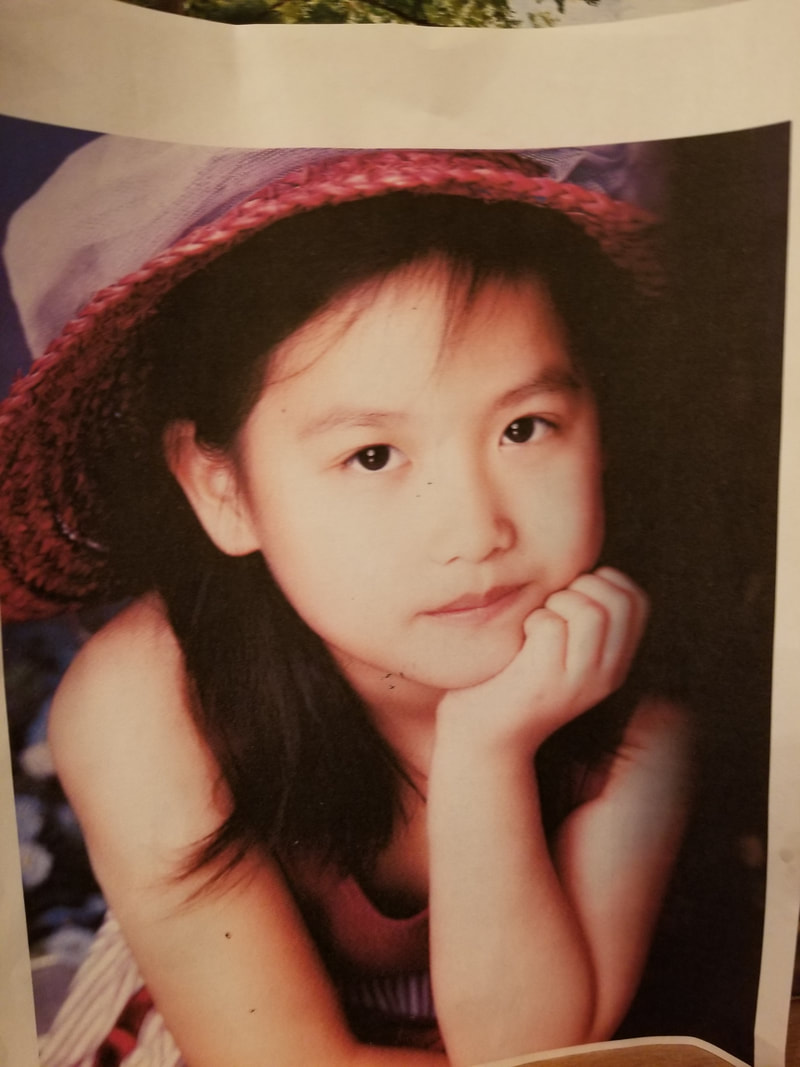
Third Idea I thought I would use some of my childhood photos for my third idea. They're all very aesthetically pleasing and I have a wide variety of photos.
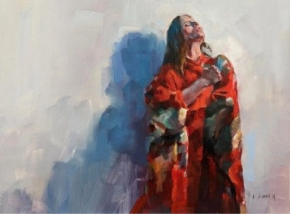
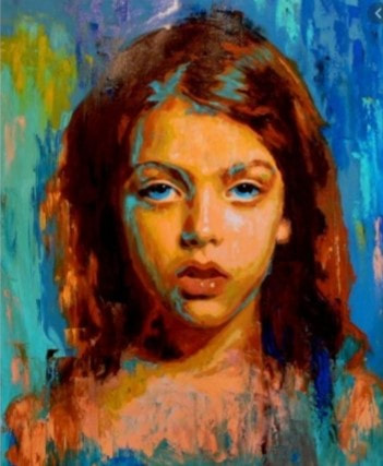
Final sketch Artist Inspiration
References
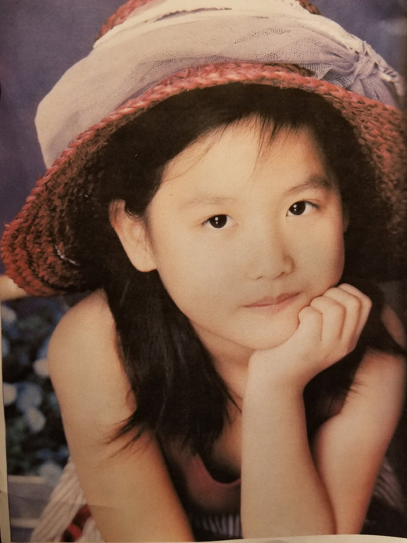
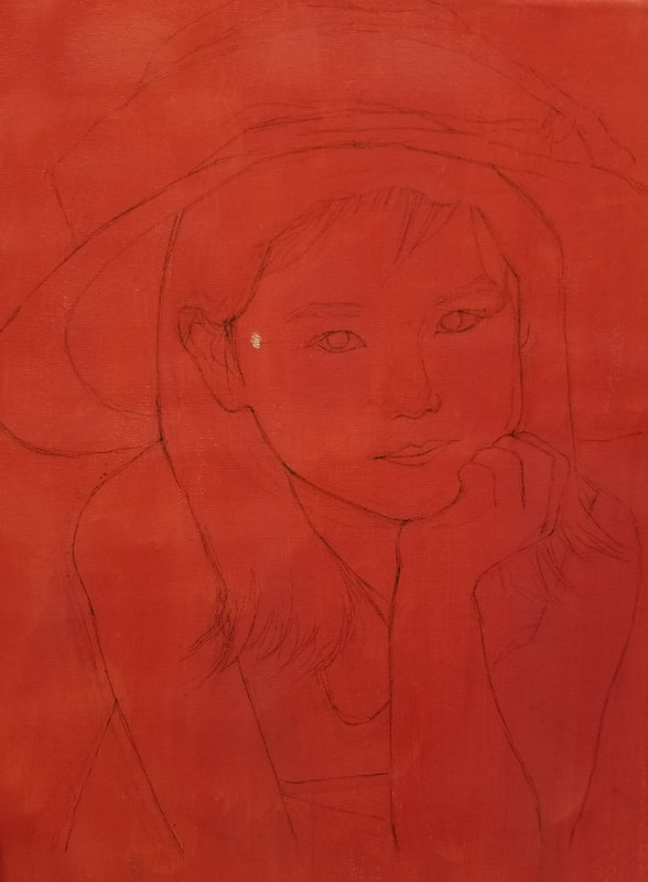
I ended up printing out two references for me to go by. I used the first reference picture as a guide for my proportions and sketch (the saturation was faded enough for me to clearly see the major lines) and used the second one for the shading/color in the skin--I wanted my shadows to have a faint pink color. ProcessWhen I began this painting, I was very apprehensive. Though I was (mostly) confident in my oil painting skill, I encountered trouble when first sketching out the piece. I usually sketch paintings with a grid to make sure that I get all the proportions correct (I hate it when I start painting and then realize something is wrong with my proportions, so I try my best to get them all right on the first try), but I decided to challenge myself and draw the sketch free-hand. After many changes, I ended up with a sketch I was satisfied with.
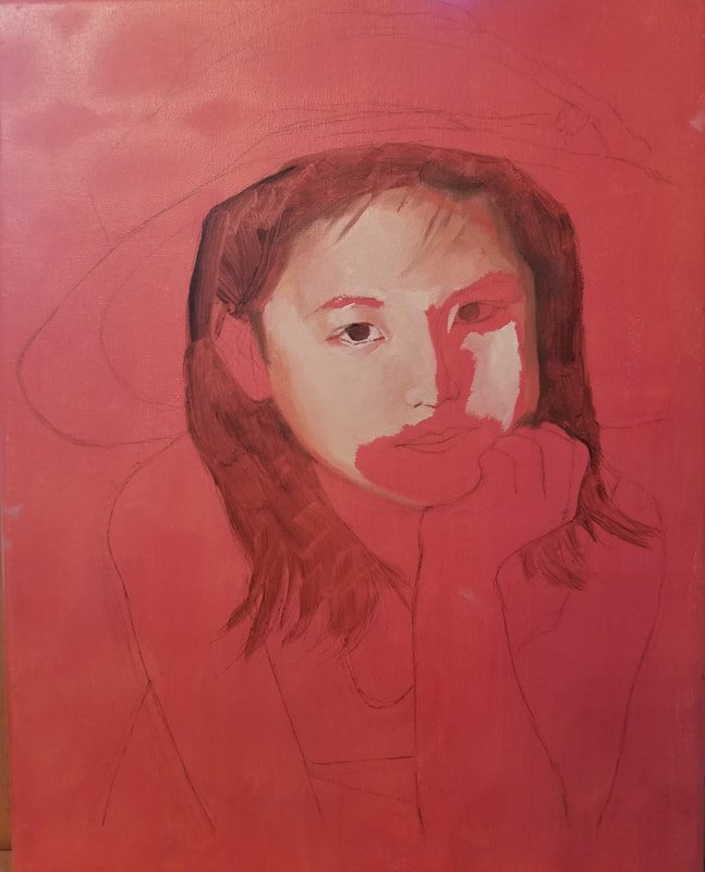
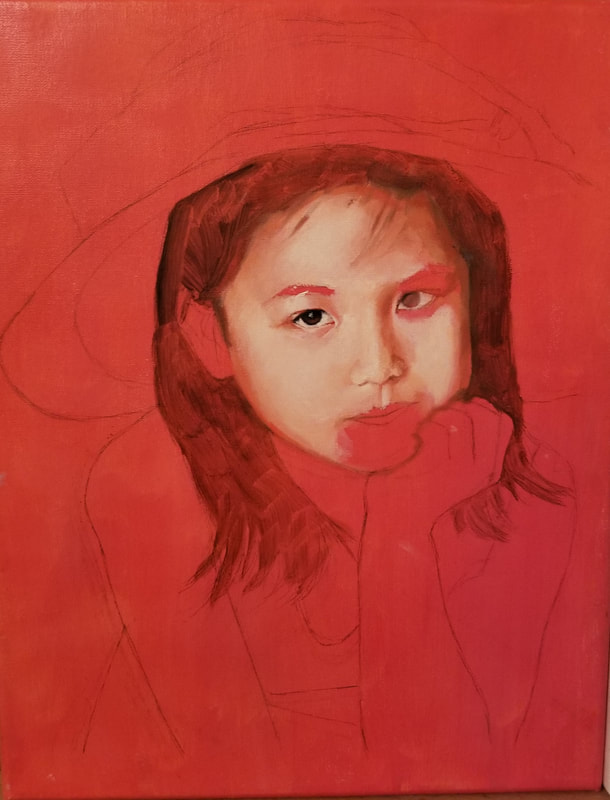
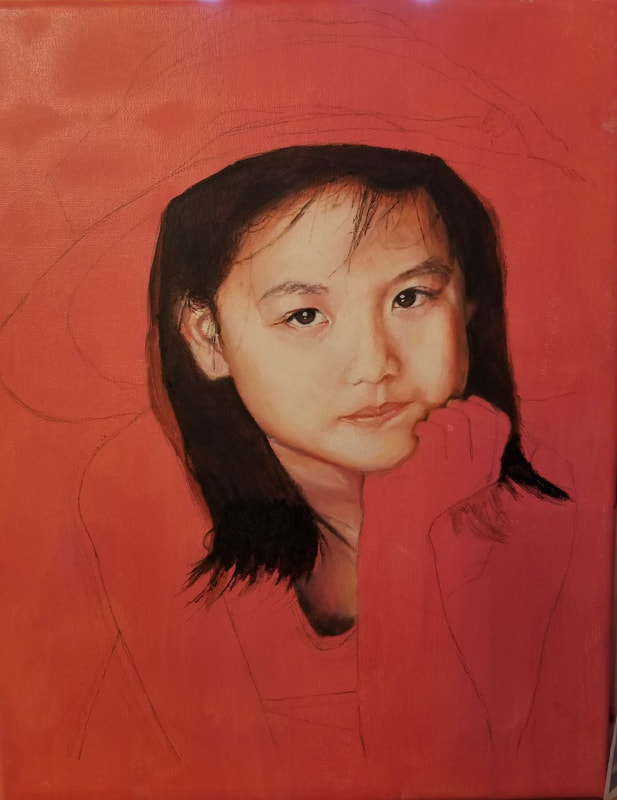
The rest of the process went (more or less) smoothly.
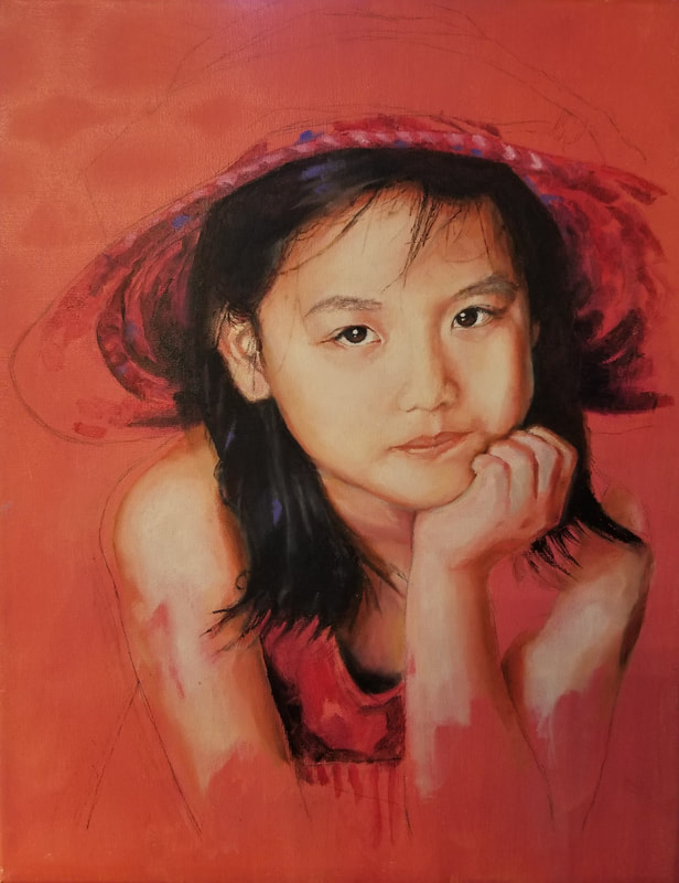
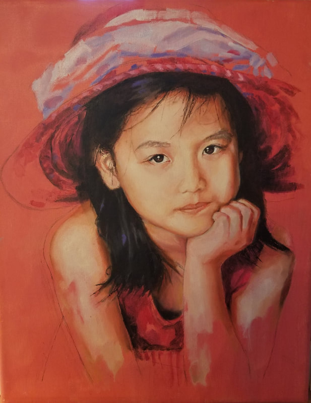
I love painting, so completing this project was a ton of fun for me. Though I had a rocky start at first, everything after painting the first eye went pretty well. I was a bit frustrated because I realized that I had drawn the entire sketch a wider than my reference. I also struggled on the mouth, which is sort of angled strangely. However, I think the overall look of the painting is similar enough for it to be overlooked. I decided to make my painting into an unfinished portrait by fading away the bottom part of my arms and by not painting in the sides of my hat. At this point in my process, I decided to keep the pink color for the background because I thought it complemented my skin well.  The background of the painting was extremely fun to paint, especially after the preciseness and rigor of painting the face. The background was something that I wanted to be loose. I incorporated many previous colors I used into the background (including skin tones, reds, purples from the hat, orange, and more). I wanted some parts of the background to be dramatically dark so my skin would stand out more. After some deliberation, I also decided to faintly outline my body in saturated orange paint, giving my figure a sort of ethereal glow. This probably ended up being my favorite part of the entire piece. I am very happy with how my final piece turned out. Final ThoughtsI was very excited to start this project, and think that painting it posed a good challenge. I learned a lot from drawing and painting this piece, particularly in drawing--I feel more confident in drawing free-hand accurately now. I also feel like putting my own spin on a self portrait helped me grow as an artist by pushing my imagination and motivating me to get more creative with my work. This was my first time painting a vignette, and I definitely think I will paint more in the future. Overall, I think this project was a wonderful learning experience.
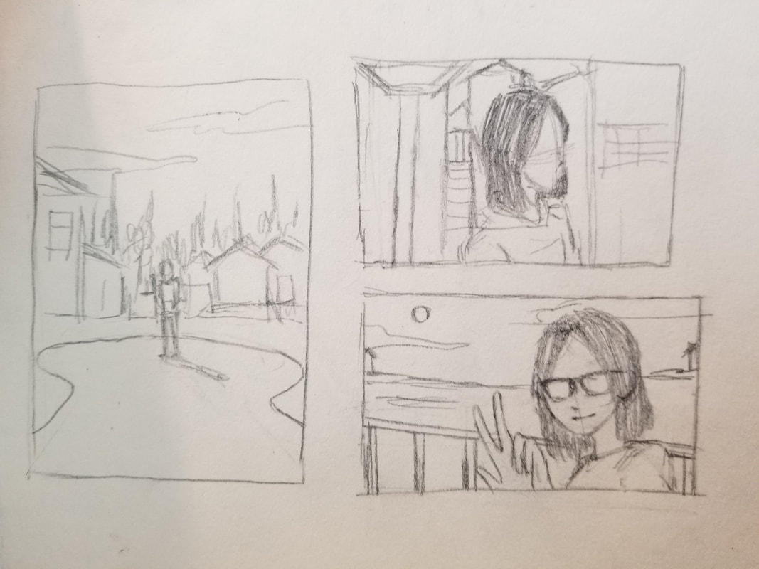
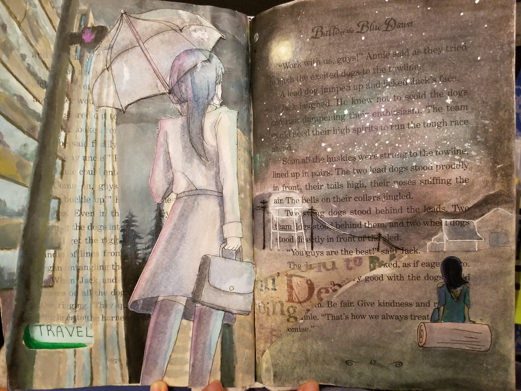
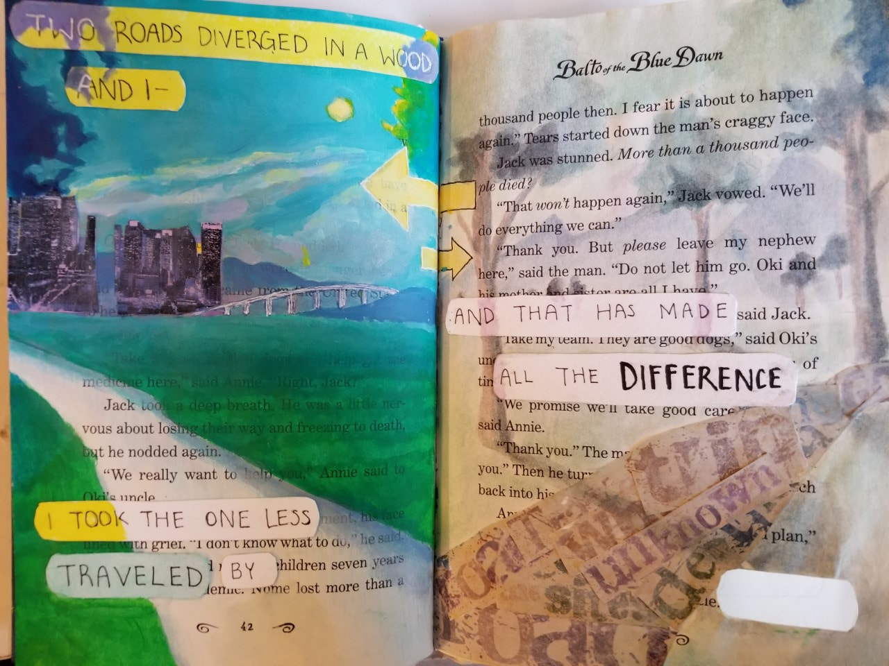
In this project, we were required to alter a book with images accompanying a quote of our choice that surround a central theme. We also had to include a "cutout" in our final work--a piece of paper that is removed in order to show elements featured on one page to show on a consecutive page as well.
sketch and idea
In order to depict the quote in an illustration, I decided to draw two roads that lead to a city and the woods. This was to contrast between the road not taken and the other, more commonly traveled road. To further show the difference between the two roads, I decided to paint the road not taken with dreamy, faded watercolor and the other with a harsher acrylic style. Continuing onto the next spread, I wanted to expand upon the differences between the two roads by showing where they led. In acrylic, I decided to paint a cityscape on the left page (alluding to the previous position of the road more traveled). On the right page, I would paint a calm view of the countryside in watercolor. first and second pages
Next, I began the first page. Using acrylic paint, I made a vibrant landscape centering around the primary color teal (with accents of lavender and yellow). This made it so the first page would both contrast with the second with much more pigmented colors, while still keeping them connected through reoccurring colors. I decided to leave the road blank, showing the original page beneath. This was to demonstrate the idea that traveling across the road not taken would be to create your own path, while traveling the first would be like traveling across a road that was already made before. Though I had, at first, painted the buildings in the far background, I decided to cover them out with cutouts (which I tinted with lavender watercolor) because I didn't like how simple they looked. 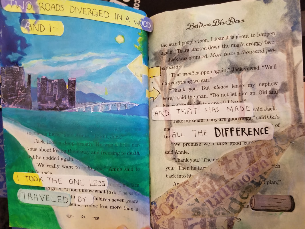 third and fourth pages
In this process, I found that I did not really like using acrylic. The medium was difficult to blend and dried quickly on my pallet. Since I am a slow painter, I had to use a lot of paint. However, I learned that acrylic is easier to work with if you simply match colors instead of mixing them on the canvas (or book page). Also, do not go over places you already painted--you'll just end up covering your old work.
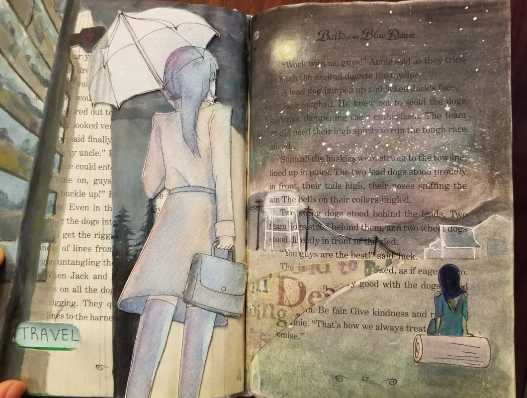
I used the same cutouts from the second page for the fourth page. This was used to show that it is the same road. I also decided to include people in the photos to show more depth in the two pages--this worked to tie them together as well. My only grievance is that the watercolor looks really faded, making it really hard to show any kind of contrast in the piece. I think that going back and using more black pigmentation in the night sky could elevate this piece more.  cutout
My cutout translates a log and the word 'TRAVEL' to different pages. The word TRAVEL appears on the third page because the composition depicts a person traveling (creative, I know). Final thoughtsAt first, I was not excited for this project. I hardly ever use mixed media and have nightmares about paper mache, especially about the glue. However, I had a lot of fun doing this project. Applying the paint was a struggle, but thinking of a quote and creating pieces with meaning was really nice and thoughtful. I also really like how the piece turned out, and feel good about the fact that I repurposed an old book into something beautiful.
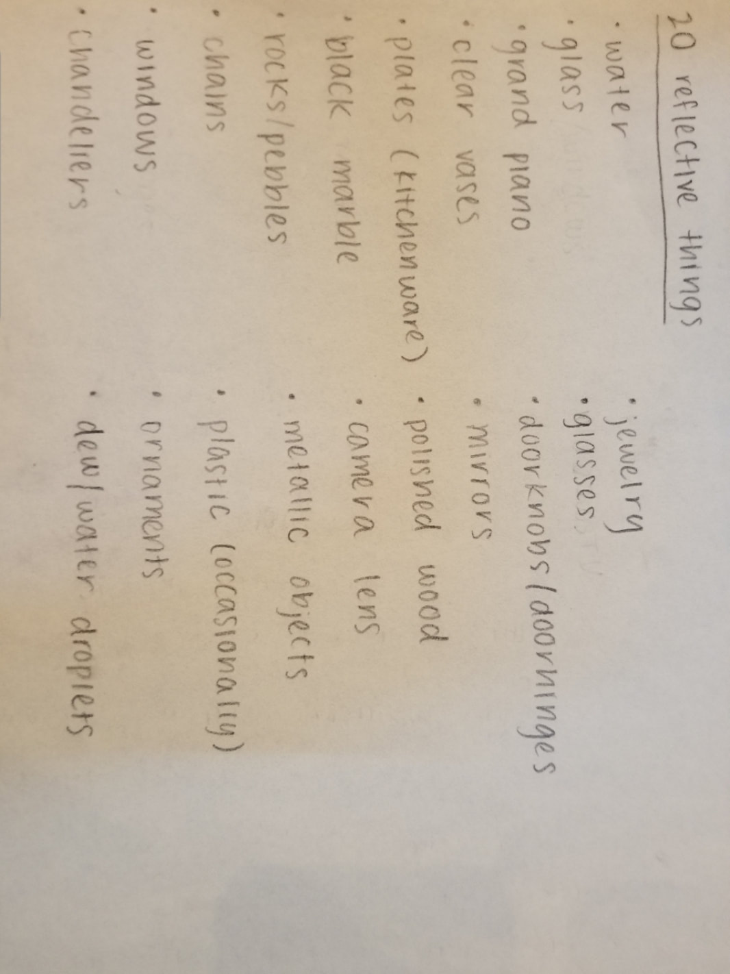
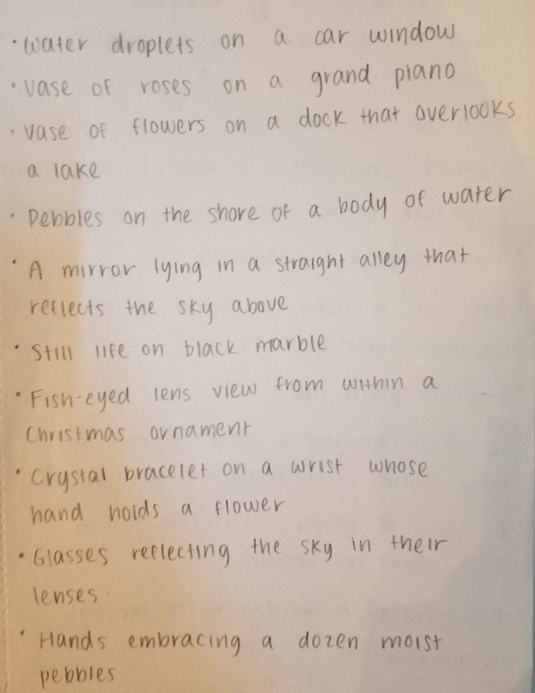
I usually only draw realism, almost never from my imagination, so doing this has been a learning experience. This project helped me think out of the box and become more creative. In this project, we were required to select objects with reflective qualities to make a symbolic depiction of something that represents or is important to us.  We began this project by outlining possible ideas and components we could incorporate into our drawing.
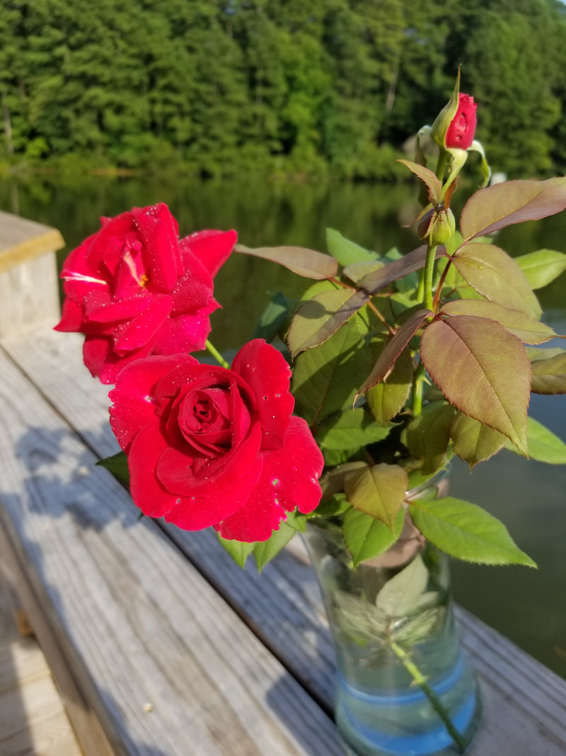
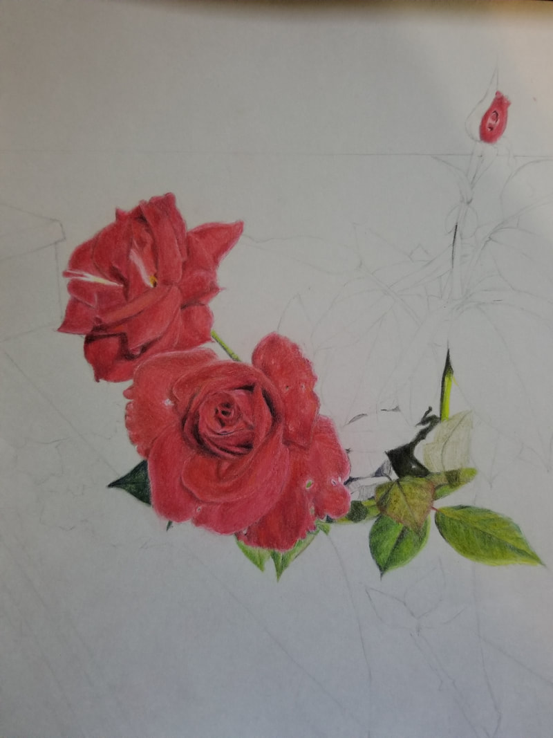
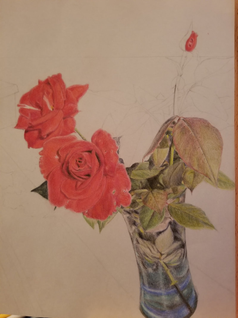
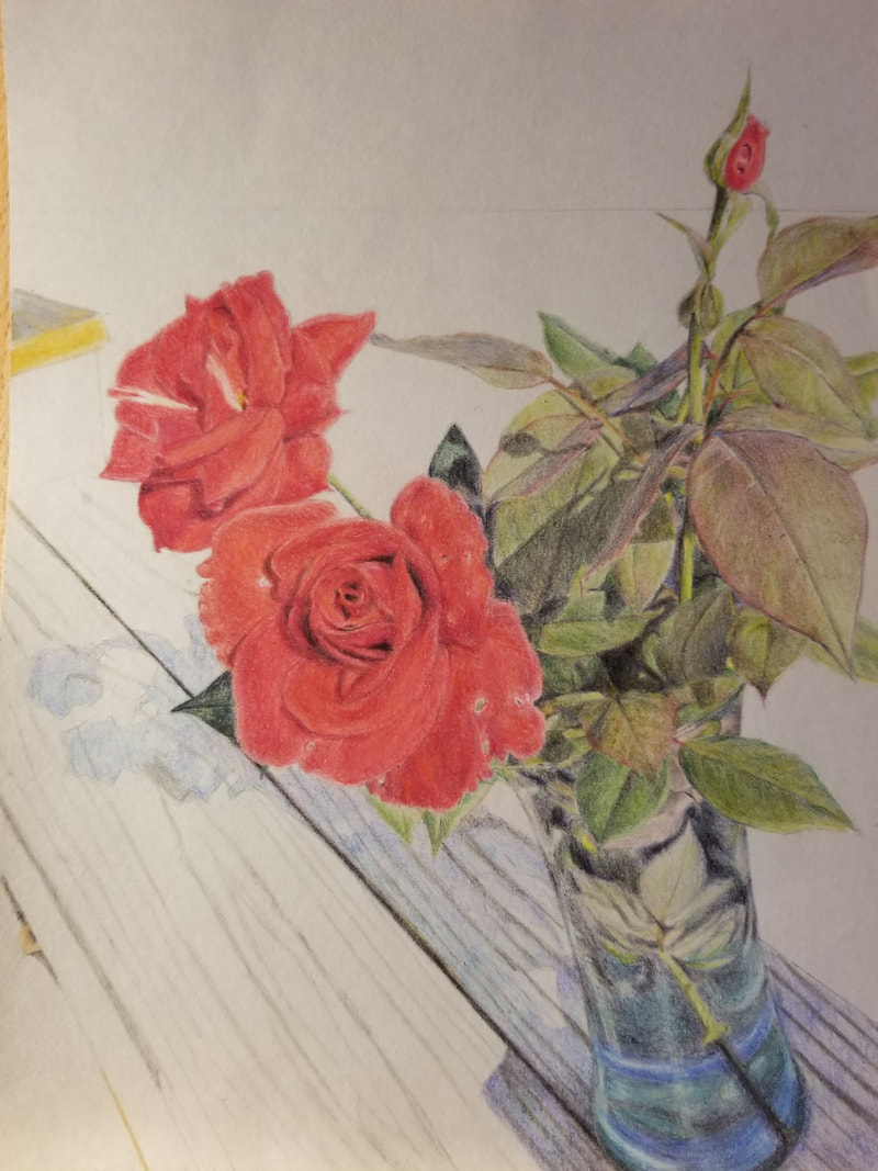
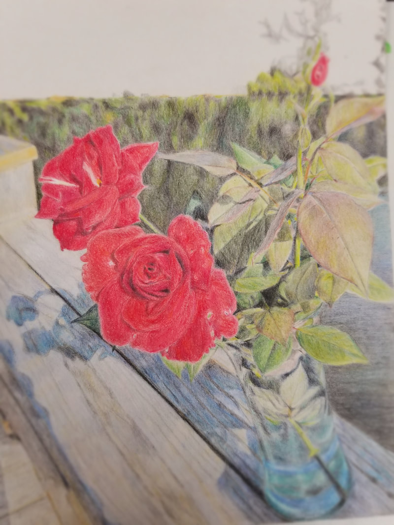
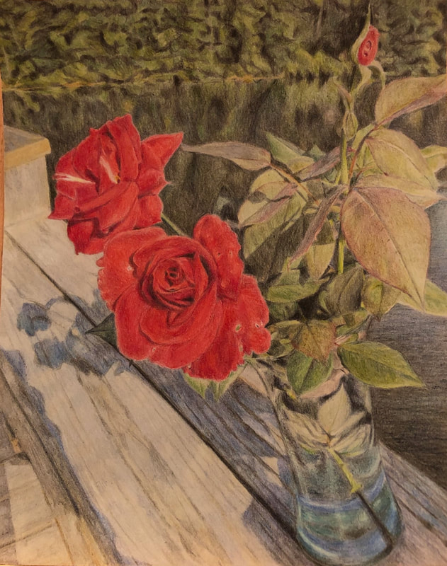
This part of the project was arguably the hardest for me. It was difficult coming up with 20 unique, separate ideas on reflective objects, especially since I typically do not interact with many "reflective" items. Some of my ideas that I wrote down were simply to fill space. I hope I can be more creative with these ideas in the future. Many of them were only the product of compositions that I believed would look appealing on paper, not because they were of significance to me. Regardless, I am pleased with the final idea I chose. 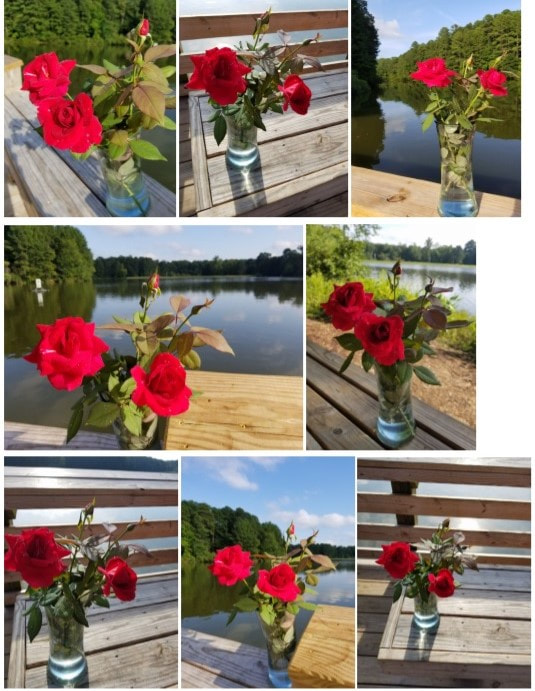 I finally settled on an idea, something I believed was both representational of me and would be entertaining and challenging to draw. I planned to bring flowers in a vase to the lake near my neighborhood and take pictures of them on the dock. Not only would they have reflective qualities in the lake's water, but also in the water in the vase itself. The dock was something personal to me, being close to my house and a place I could exercise, and the flowers were ones which my grandfather grew himself in our front yard. The roses served a double meaning for me. Not only were they grown by a close family member, I remember that I first began to take drawing seriously by drawing roses in class in sixth grade. After deliberation with the class about which picture I should choose, I decided on this one:
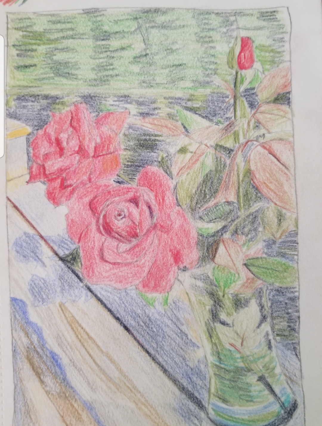
The process
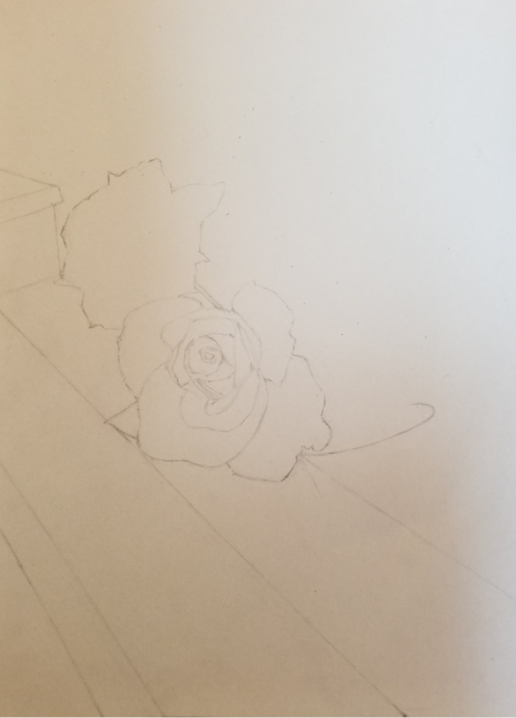
In progress photos
I am pleased with the final outcome.  During this project, I encountered a couple different problems. First and foremost, the color. There was no conceivable way that I was to achieve the sort of saturation that the reference photo boasts, so I eventually decided to forget about it and instead carve out a more detailed and shadowed flower. I also had a bit of trouble with the greens. Maybe it was only my pencils, but I noticed that my green pencils were tough and would rip the paper, which was pretty flimsy as well. I will look into better materials should we do another similar project in the future. I did not have any other such problems when drawing the rest of the vase and flowers. When moving onto the background, it was mainly smooth sailing. The wood was enjoyable to draw and the water less so, but nothing majorly exhausting. The trees in the background, however, were a hassle. The multitude of trees were hard to keep track of and even harder to draw without loosing my pace. I ended up cutting an inch off the top of the picture as I wanted to minimize the amount of work I would have to do. I eventually decided to fill in all the shadows first with dark grey and add in all of the green parts after. Although I think the trees look fine in the context of the picture, they look kind of strange alone.  A side by side comparison Overall, I think this project gave me more confidence when approaching pencil drawings. I typically don't use colored pencils, so completing this project was a bit daunting. I have learned how to be creative, how to struggle, and how to overcome.
In this assignment, we were required to draw a fruit or vegetable with colored pencil on black, tan, or grey paper. 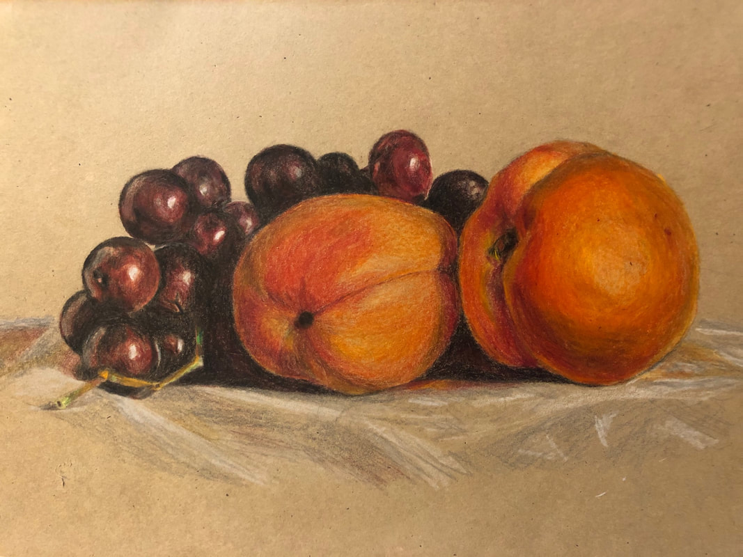 Credit to original photo: https://www.amylamb.com/artwork/still-life-with-apricots-and-grapes/ Right when I began this project, I decided to draw a classical still life. This went well as I think the final picture looks much more dynamic than a standard fruit picture, however, it was tiring to draw. I was displeased at first because the colors didn't turn out as vibrant as in my reference photo--I realized quickly that this was a limitation of using colored pencils. After coming to this realization, I decided not to get each fruit as accurate as possible, but to make the impression of the overall picture about the same. I also came to some issues with my initial sketch as I noticed that I had made the grapes too large and the shape of the apricots too plump. However, I decided to ignore these minor issues as they didn't seem to lessen the impact of the picture. Drawing the shadows was also challenging. I began to only color in the shadows with black, however, this did not work. The shadows looked flat and one-dimensional, not to mention that the black looked more similar to gray. To combat this, I added red to the black to make it darker. When I got to the background, I decided not to completely render in the grey cloth that the objects lay on and instead only give the basic impression of its texture and folds. Other than these peculiarities, drawing this picture was a relatively straightforward process.
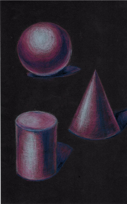
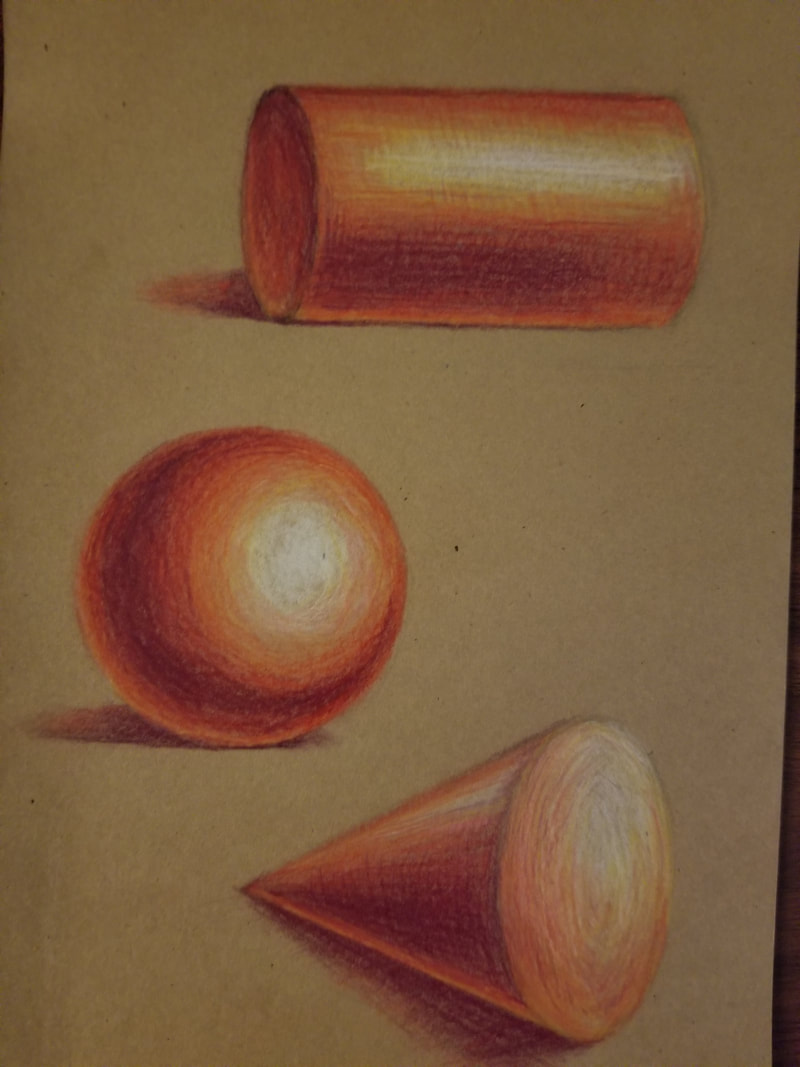
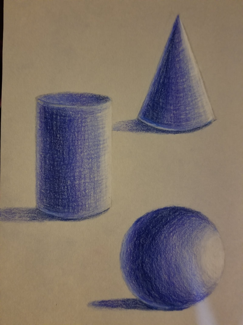
For this assignment we needed to draw three forms (circle, cone, cylinder) each on three different colored paper using only three colored pencils plus white.  These are the first three forms that I did. I struggled at the beginning as this was the first time I was drawing on black paper and the fact that I had to fill in the lights and color the shadow something lighter than the paper itself was a hard thing to grasp at first. I had to be very careful with the shading. Adding to this, I also had to shade along the form of the object--this was pretty easy for the circle, but not so much the others. For the cylinder I ended up drawing circular arcs around its vertical height and drawing straight up and down to show both its roundness and vertical structure. The top of the cylinder proved a challenge for me, and I'm not very satisfied with how it turned out. I did largely the same thing with the cone, only angling the vertical lines so it reaches the base and connects with the top at an angle. Overall, I would say it turned out fine enough, though I think I could've done better with the cylinder and the shadows of the objects. I also wish I had dampened the opacity of both the lights and the darks so the objects wouldn't look as "glassy."  This is the second picture I did. Since I had already done the basics in my last drawing, I decided to challenge myself by drawing the cone and cylinder in a different position. I think my favorite part about this drawing is the line work that I did--the texture on these objects had improved from the last. One thing I struggled with in this drawing was the bottom on the cone. Since the position that it is in is quite particular, I had to think about where the light would hit and how it would interact with the shape of the cone. I think it turned out good. One thing that I liked about this was the shadows. While the shadows on the first drawing were mediocre and didn't show up so much, these were much more vibrant. I believe this has to do with the tone of the paper.  In this last drawing, I ended up placing the light source directly to the left of the paper. This changed some things. First, the shadows were elongated and sometimes extended out of the paper or into another object. Second, it was much harder to give the object depth and dimension because of the juvenile shading method employed (i.e. white, light tone, mid tone, dark tone). This difficulty might also be affected by a number of other variables. For one, the color of the paper was much closer to white than any of the others, meaning the the white and light tone didn't stand out nearly as much. Secondly, I had chosen an entirely cool roster of colors to complement the cool tint of the paper. Unfortunately, I realized too late that my mid tone had a warm tint, not a cool one. If pressed hard enough, my mid tone was around the same darkness as my dark tone. This meant I had to carefully control my pressure on the paper to give it a gradient look. Luckily, I think the final product turned out good, though if I were to continue to edit the picture I would add more color so the objects wouldn't look as streaky.
All of them together
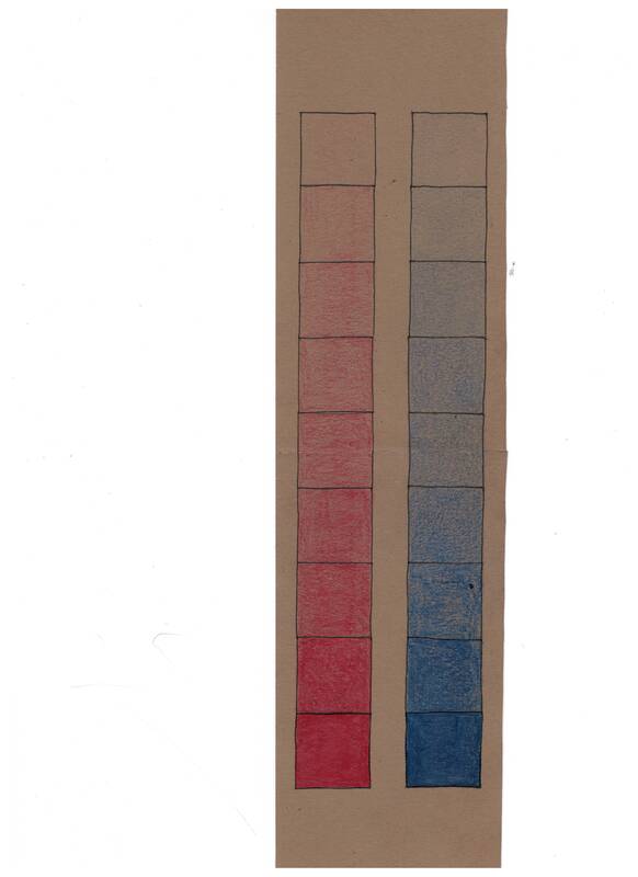 For this assignment, we were required to do two 9 step charts showcasing the different values of a single color. One of the problems I ran into whilst coloring in the one inch squares was making sure each section was a slightly different value than the last. I think even in the final product, some adjacent values are too similar. Additionally, the pencil I used to draw the grid didn't show up enough in the beginning, so the larger rectangle resembled more of an ombré than a color chart. To combat this, I relined the pencil marks with pen. Despite these minor problems, I think the final product turned out decent.
|