1. Reflect on what your portfolio (all work you created through semester) may or may not reveal about the semester. Do you think the work in your portfolio is an accurate reflection of your development in the class?
|
|
|
I know we're only supposed to put one or two photos, but I couldn't help adding the apple trifecta 😂 I think I probably have an undiagnosed apple obsession.
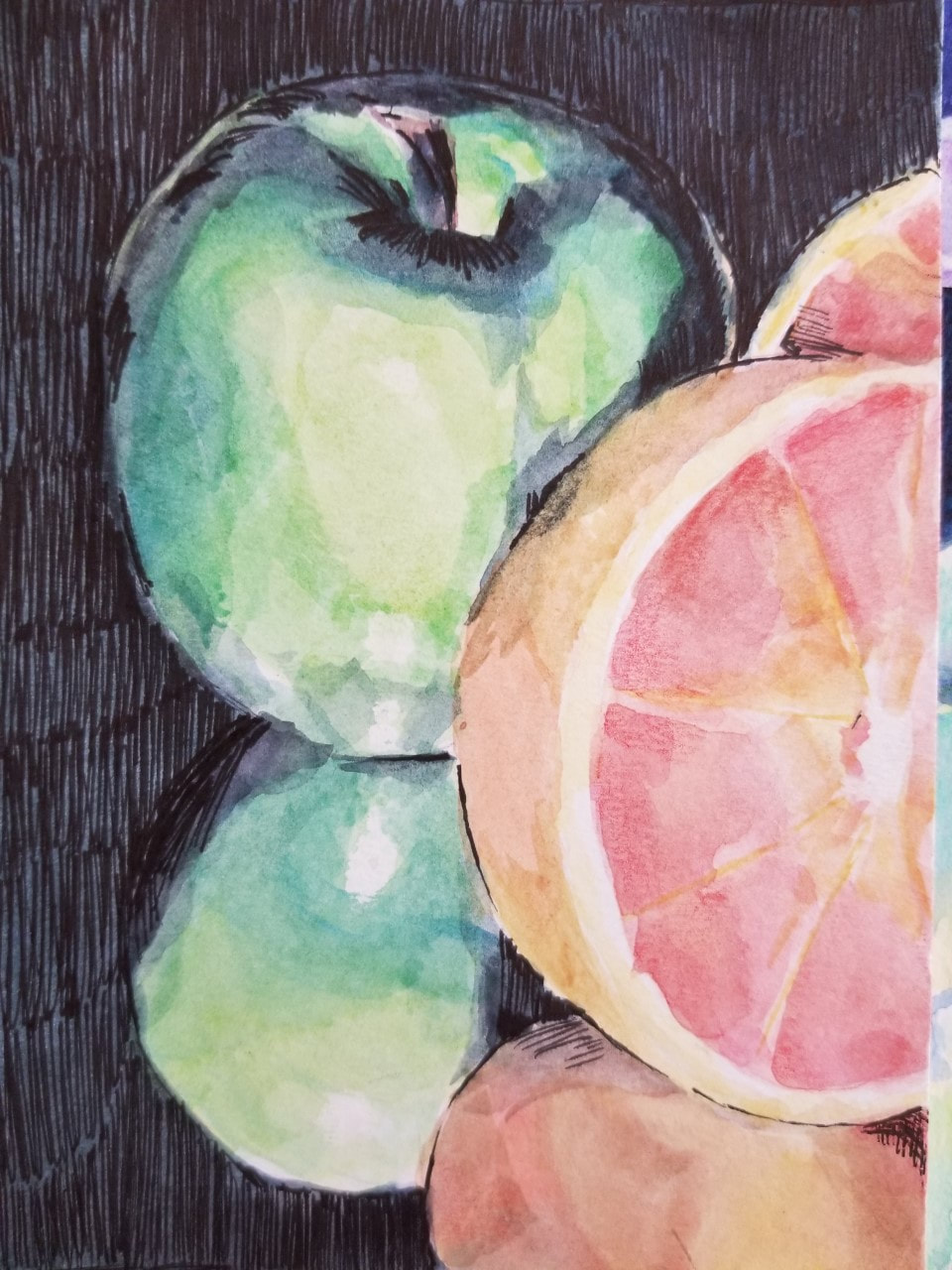
I think these photos accurately describe my time in this class; they serve both as a point of comparison (same subject matter) as well as a display of different mediums (left: watercolor, middle: acrylic, right: oil). All are visually pleasing in their own way, but you can clearly see my development as time passed. The watercolor, although rendered well, is not the most detailed, and the reflections of the fruits on the table look too vibrant and break the viewer's immersion in the piece. If I were to go back, I would lightly brush over the reflections with a very, very watered-down blue to separate the reflections from the objects. Also, funny story, I showed my brother this piece and he said the background looked like a bunch of tiny black worms. So maybe I would also try out a different texture with the pen...
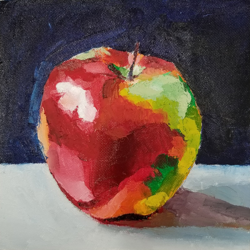
The second painting is similarly well-rendered, but I would argue that I stuck too close to the reference in this piece. I took no liberties with the reference and essentially copied it down; the painting, thus, looks stale and almost empty. In contrast, the last piece done with oil looks lively and fresh because of its vibrant colors and impressionistic strokes. This series of paintings demonstrates how I changed my painting style to be looser and more unrestricted during the course of this semester.
Extra: The first ever oil painting I did was also of an apple! Crazy how things work out sometimes :)
I think these photos accurately describe my time in this class; they serve both as a point of comparison (same subject matter) as well as a display of different mediums (left: watercolor, middle: acrylic, right: oil). All are visually pleasing in their own way, but you can clearly see my development as time passed. The watercolor, although rendered well, is not the most detailed, and the reflections of the fruits on the table look too vibrant and break the viewer's immersion in the piece. If I were to go back, I would lightly brush over the reflections with a very, very watered-down blue to separate the reflections from the objects. Also, funny story, I showed my brother this piece and he said the background looked like a bunch of tiny black worms. So maybe I would also try out a different texture with the pen...
The second painting is similarly well-rendered, but I would argue that I stuck too close to the reference in this piece. I took no liberties with the reference and essentially copied it down; the painting, thus, looks stale and almost empty. In contrast, the last piece done with oil looks lively and fresh because of its vibrant colors and impressionistic strokes. This series of paintings demonstrates how I changed my painting style to be looser and more unrestricted during the course of this semester.
Extra: The first ever oil painting I did was also of an apple! Crazy how things work out sometimes :)
2. How do you describe your artistic style/perspective? How do you define success as an artist? What do you find most rewarding about being an artist? What are some of the most important skills you draw upon to create your work? What are some of the most significant things you've learned through art-making?
|
|
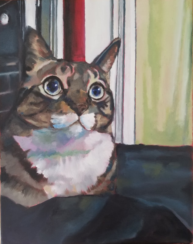
I've always been of the opinion that the best art carries some sort of emotional weight within it. This is represented by my painting of my aunt's cat, who I painted in order to rekindle my connection with my extended family. This painting's success wasn't limited to its technical aspects, but also affected real people. This is exactly what made it rewarding to me, because these simple values on a canvas were able to
|
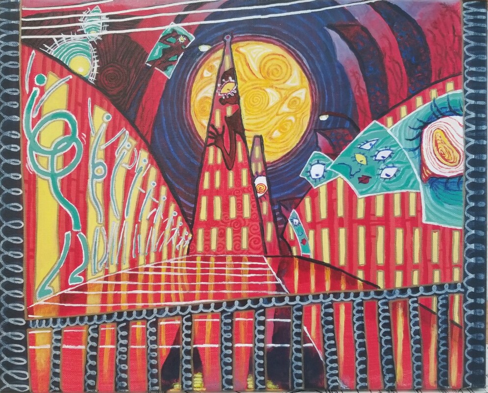
translate to something real and tangible. The second photo of the city was made in order to create an unsettling aura and make the viewer feel something. In this piece, I translated ideas such as losing control and being under scrutiny into visual form--these deeper ideas, I feel, give the painting more depth and weight. Though this is not my most technical piece by far, I feel especially proud of this piece because of the storytelling within it. These lessons all contributed my newfound desire to be active in finding depth in the world around me.
3. Discuss one project where you felt you were the least successful. Explain why you felt this way. What would you do differently to change this piece? Explain.
|
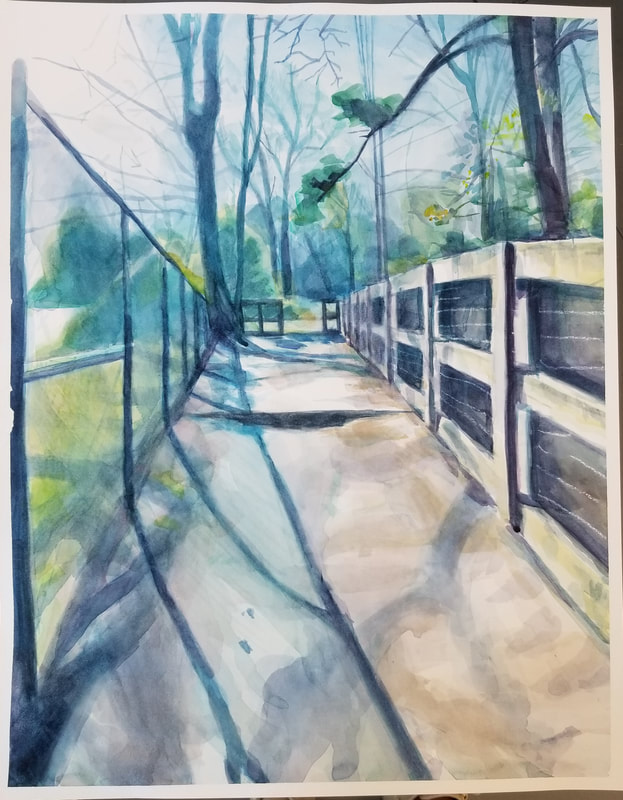
I don't think this painting is all that bad, it looks atmospheric and visually pleasing in its own way :) I remember I was really proud of this when I completed it. However, looking back on my work from this semester, it looks just really...empty. I feel like I could've done a lot more with it. I actually finished this earlier than the due date but grew complacent during the latter half and sort of stopped. In a way, this emptiness contributes to the atmosphere of the piece, but I just think there's a lot of potential in it that I wasn't able to recognize. If I were to go back, I would add more leaves on the ground and try to darken the painting more. I believe adding more elements such as fallen leaves will make the painting look more grounded in reality and give it more of a mature technique. Adding in small details like the chain link pattern on the left or the bushes peeking through to wooden fence could also take this painting to the next level.
|
4. Look at your body of work over the semester and choose 2 pieces that show your growth as an artist. Discuss each piece and how you grew in the following areas: application of materials, techniques and skills, artistic vision, use of the principles and elements, creativity, intuition and subject matter.
|
|
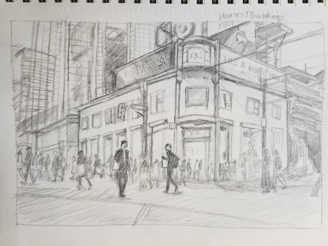
These two paintings are similar in that they are both drawings of cities and buildings, however, the way I executed them was completely different. The picture on the left was one of the first drawings we did in the class, while the picture on the right was from our acrylic unit. You can see that the first drawing is crowded and sloppy, with the perspective being slightly off yet still noticeable. The main focal points of the two people in the crowd are underdeveloped. This picture would've looked much better had it not contained a horde of indistinct people, but it looks like I stuck too closely to the reference and didn't use artistic interpretation.
On the contrary, the painting on the right was practically made with artistic interpretation and used unnatural colors and uneasy imagery to capture a specific feeling. This difference in style and choice parallels how grew confidence in myself and my creativity throughout this course; from copying a reference to not even using one. It should also be noticed that the perspective distortion in this piece is actually intentional, whereas the other, uh...let's just say I had a bit of difficulty...
On the contrary, the painting on the right was practically made with artistic interpretation and used unnatural colors and uneasy imagery to capture a specific feeling. This difference in style and choice parallels how grew confidence in myself and my creativity throughout this course; from copying a reference to not even using one. It should also be noticed that the perspective distortion in this piece is actually intentional, whereas the other, uh...let's just say I had a bit of difficulty...
5. Choose 2 mini lessons that you felt were the most beneficial in your learning for that particular project. Include photos of these and explain thoroughly. Do you feel you needed more instruction for success? Explain or did you feel that the instruction given was enough to ensure success? Explain.
|
|
|
Wow, the reappearance of the apple! I'm actually really proud of this piece, I felt like I was dying while painting it, but it really came together once I added the dark background. In this demo, we used a palette knife to paint a vibrant apple in oil. I had used palette knives to paint once before--it didn't turn out that well, as the palette knife isn't as dexterous as a paintbrush. The instruction given by Ms. Rossi was thorough and taught us exactly how to properly wield our knives (this is a weird sentence). However, the main point of this practice to me was the vibrant colors we
|
used. I don't think I would have chosen permanent green light for this piece, and don't doubt that I would have greyed down the reds considerably to match the reference. But it is these colors that give the painting life! Goes to show that copying the reference isn't the only way to succeed.
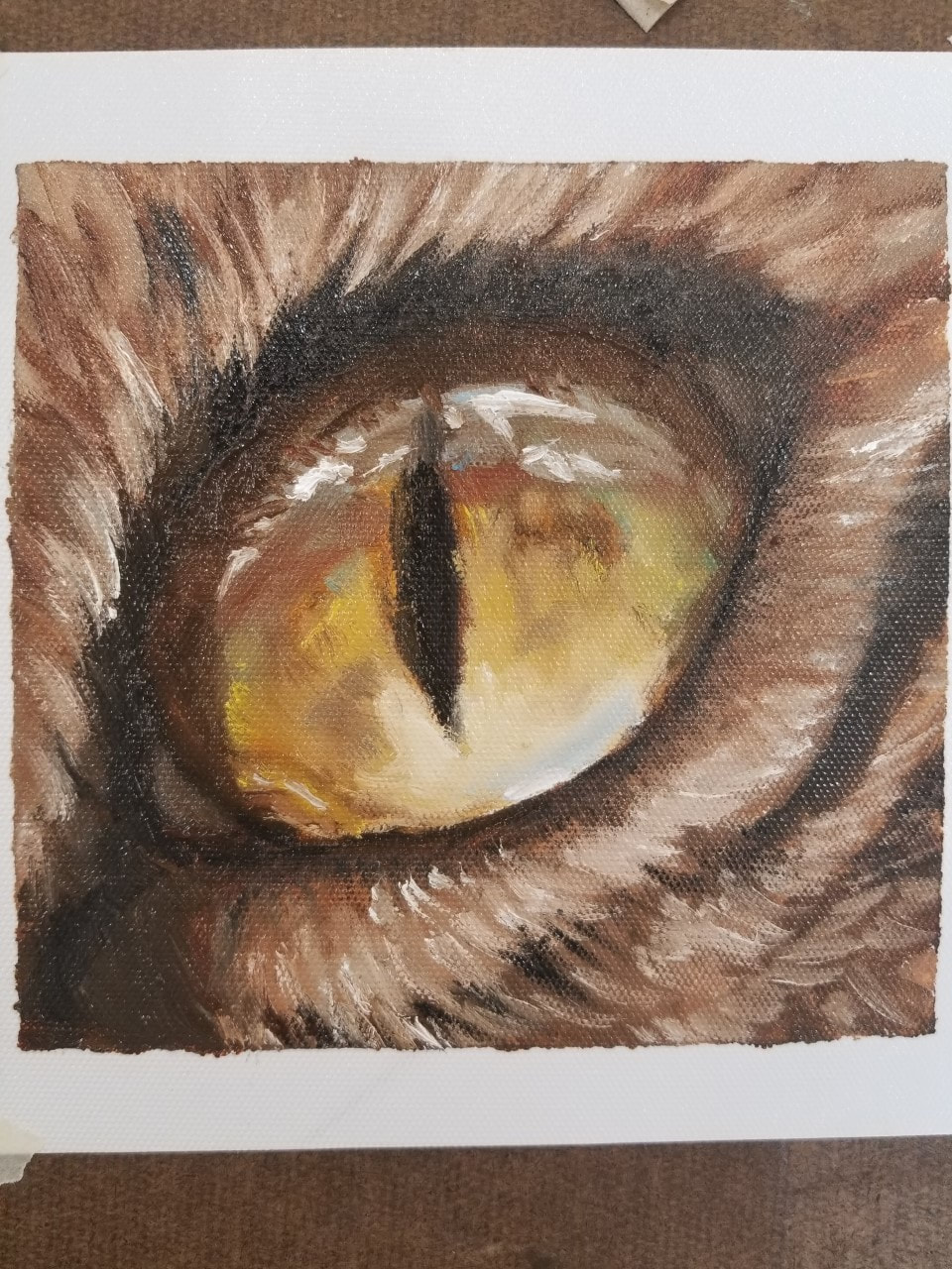
The second photo of the cat's eye is just neat to me--I love the way the highlights give the eye a round shape. I learned a lot about glazes during this practice, but unfortunately, I was unable to use any because the base layer wasn't dry at the time. This helped me a lot in learning about dimension & reflections, but I do wish we could've learned it in class rather than by a YouTube video.
The second photo of the cat's eye is just neat to me--I love the way the highlights give the eye a round shape. I learned a lot about glazes during this practice, but unfortunately, I was unable to use any because the base layer wasn't dry at the time. This helped me a lot in learning about dimension & reflections, but I do wish we could've learned it in class rather than by a YouTube video.
6. Look over the portfolios of other students in our class. Choose a piece of artwork from one of your classmates that you feel is an exemplary showcase of what the project was to depict. Discuss how the artist used the medium, utilized the elements of art and design principles, was original with their ideas and went beyond their comfort zone or the realm of the requirements. Make sure you have the image of their artwork along with their name (first name only) posted with this response. Also include a link to their portfolio.
|
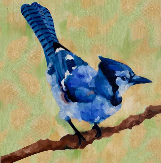
Artist: Daniela
Daniela's website: https://dani-montanez.weebly.com/art-1 I have no words; this painting is just so stunning! Just kidding, I actually have a lot of words about this ;P Daniela, I'm in awe of your ability to go above and beyond simple projects to create beautiful works of art. I'm currently debating--should this go in a museum, or in my living room wall? This is a joke haha, but this is actually so lovely. You really made something one of a kind! Analysis: First off, I've just gotta say that I love the impressionistic look she gave the bird! Not only is her anatomy spot on, but the extra flavor she gave the feathers really cements this painting as her own. I notice that in her description of the piece, she mentioned she was trying to go for a realistic |
style but ended up using this instead because of the time limit. I have got to say I love this outcome so much more! It's funny how art works out sometimes; everything always happens for a reason!
The style looks almost like the painterly East Asian art I grew up with--the dreamy look and the bird-and-branch motif reminds me of this kind of art. This is what drew me to this piece in the first place, it's just so elegant and pretty!
Last but not least, I just LOVE the background of the piece. The green and orange complements the blue of the bird so well, and sort of gives the illusion of leaves in the distance. The branch is so well done as well, I can just tell she put so much care into this piece! Honestly, if this doesn't win artist of the week, I'm going to throw some hands for real ᕦ(ò_óˇ)ᕤ
7. What medium was your favorite to work with? Explain why and how you were able to master the techniques associated with this medium.
|
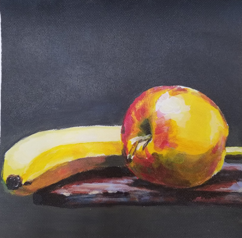
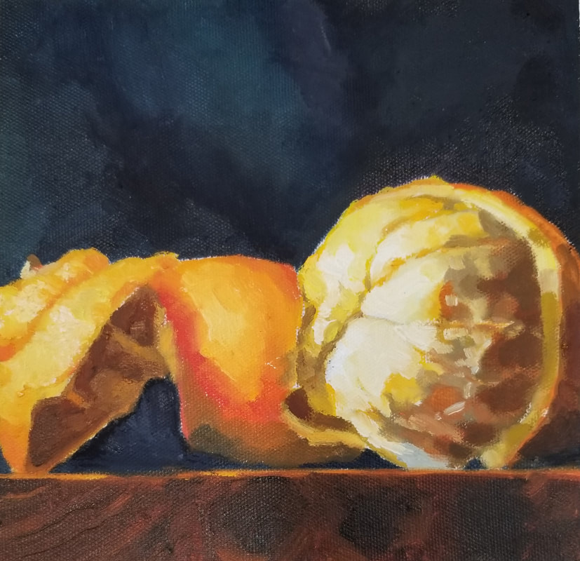
Oil was my favorite by far. It's not very surprising, I chose to mainly paint in oil for a reason after all! But even after experiencing all the other types of painting styles, I still have to say oil dominates. It's extremely fun to work with and very forgiving as well (unlike watercolor). It just seems like oil paint always has the most vibrant and luxurious colors--as depicted in my oil paint orange to the left. So creamy...so bright...
Could I have achieved this look with acrylic, or even watercolor? Sure, with time and patience. But if these are equivalent to working a job, oil would be your get-rich-quick scheme. Though it has a steep learning curve, once you get into the groove of it, everything flows out quick and easily--colors are easy to blend, and remixing is mostly a non-issue. You can also use different types of tools to apply oil: you could |
use a paintbrush, a palette knife, an actual knife, a spoon, the choices are endless. Tell me, could I use a palette knife to paint acrylics? No! Oil also has the advantage of feeling like cake frosting, which makes painting feel satisfying and less like a chore.
Mastery of oil comes with experience, as with all skills. I haven't mastered oil, but I have a pretty good grasp on which colors mix to what and know how to break down forms into simpler parts, which helps make my work look decent most of the time. You can just call me the oil guru I guess 😂
Mastery of oil comes with experience, as with all skills. I haven't mastered oil, but I have a pretty good grasp on which colors mix to what and know how to break down forms into simpler parts, which helps make my work look decent most of the time. You can just call me the oil guru I guess 😂
