Here are my two practices! That animal's fur has definitely seen better days, but what can I say? Honestly, I'm more pressed about the fact that I totally botched the border of the practice by cutting pieces off like an idiot 😂 but luckily, my epic weebly editing skills make it so you don't even know about it!
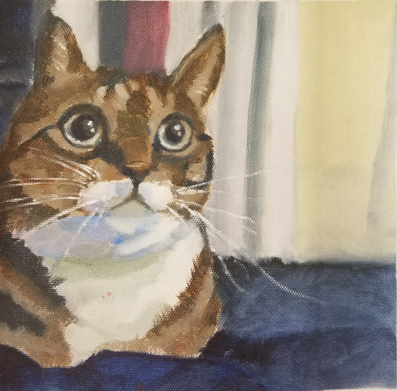
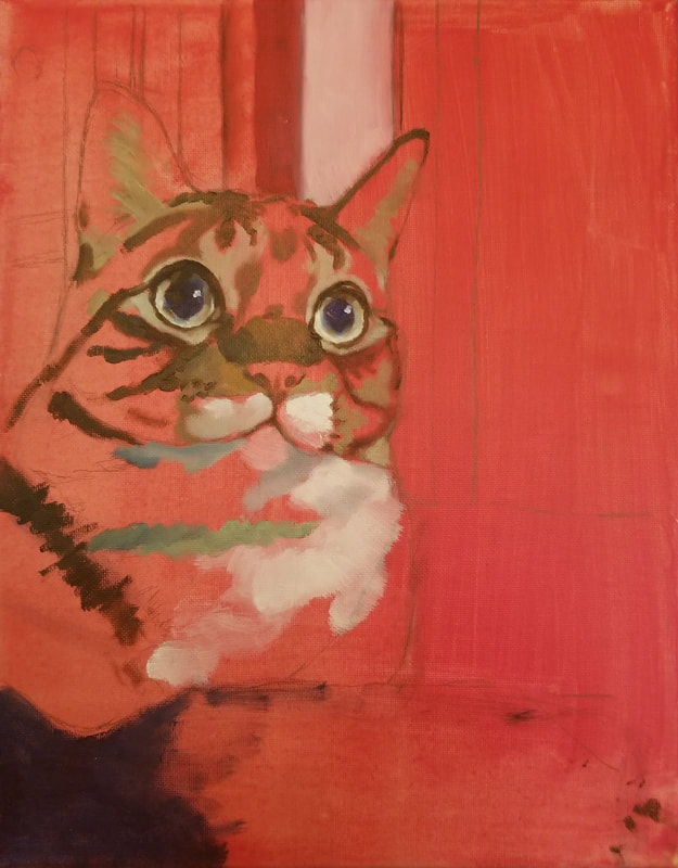
I'm pretty proud of my eye, it looks pretty good! I had to pause a million times during the video because the person painting was going at insane speeds. I'm glad all my effort was paid off in the end (I should not have put so much effort into the practices though haha) >.> I feel pretty bad that I wasn't able to use much of these techniques in my final painting though. Since I was in a rush to do the painting, I wasn't able to paint the cat's individual hairs like I hoped and instead just went back to my old method of blocking in colors. My cat's pupils were also circular and not narrowed, so I wasn't able to get much detail into his eyes. It's unfortunate, but I'll definitely make sure to keep these techniques in mind if anyone asks me to paint their pets in the future (unlikely but possible!).
0 Comments
Composition/References
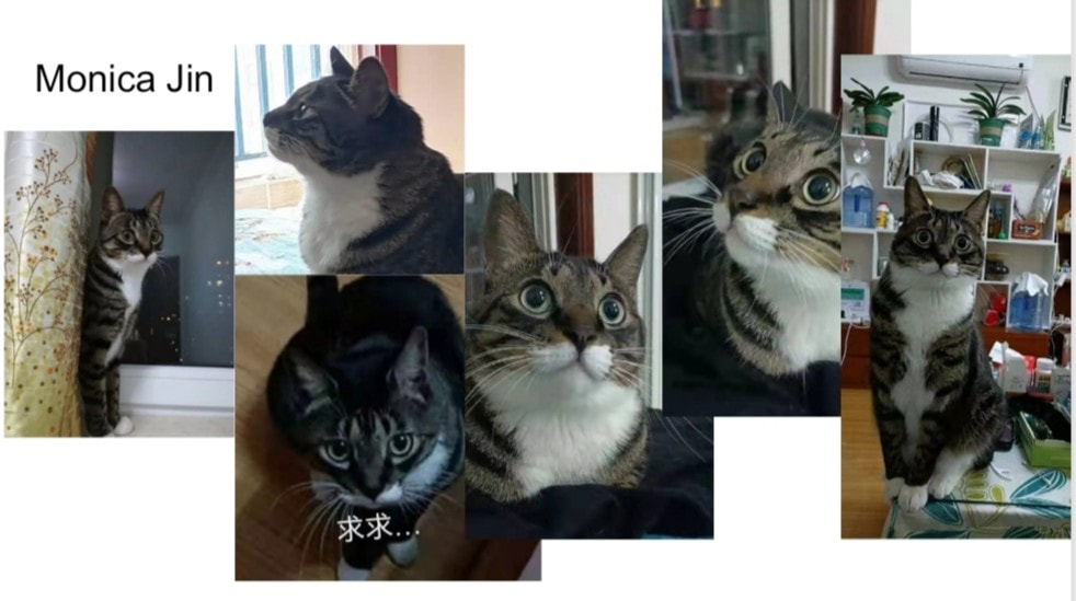
Originally, I was planning to base my painting off my dog, but she kept moving around when I was trying to take a good photo of her 😅 luckily, my aunt and friend were nice enough to lend me some pictures of their pets instead! I chose to paint my aunt's cat, Tony, because she was able to give me a variety of close-up photos. His eyes are so bright! Color Sketch
Progress
Final Reflection QuestionsDescribe the craftsmanship of your painting. (Is it neat and well-executed, edges finished, clear and well done?)
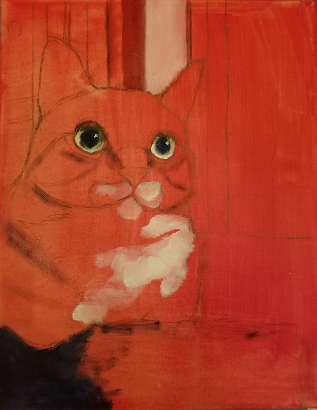
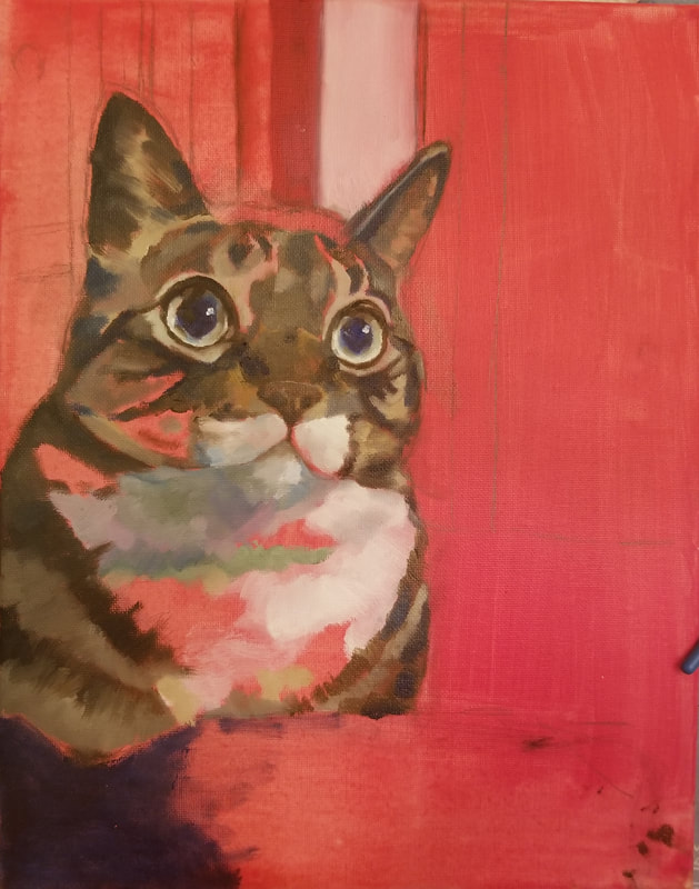
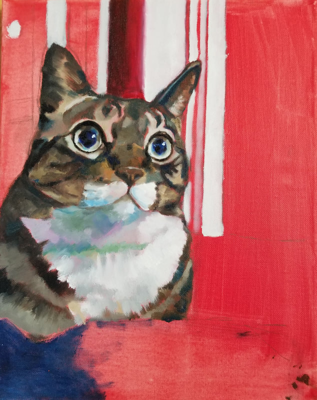
I think my painting was pretty well done and clear, though I unfortunately also left little spots of red here and there on Tony's fur. I'm hoping that no one will notice; fingers crossed! In my opinion, it doesn't seem like such a big deal--in fact, I think it gives the painting a bit of extra life to it...somehow. Although, if I had extra time, I would definitely go back and do a bit of cleaning up. How does your work use the Elements of Art (Line, shape, color, value, form texture, space)? The repeated vertical lines depicted in the background serve to push the wall back and bring Tony forward. Further, having the left half of the painting be mostly in shadow while keeping the right half mostly light draws the eye to the right side of the painting and, consequently, Tony's eyes. Since I tried to make his eyes the focal point of the painting, this worked out pretty well! I also think having Tony be more to the left of the canvas with his eyes looking to the right side accentuates the viewer's immersion in the piece--they, too, get a sense of what he is looking at. I tried making his fur a consistent pattern, but I wasn't able to go very in depth with its texture. The extent of my texturing is depicted in the white fur on his torso. I hope I was able to give a sense of furriness while still using a more simplistic style. Describe your choice of subject matter, why did you choose this animal and what is the painting saying about the subject? As I stated before, this is my aunt's cat, Tony! I haven't seen my aunt and the rest of my extended family for over five years, as my immediate family are the only ones who live in the U.S. When I last stayed with my aunt, I was pretty close with her cat named Fan Fan. Tony is Fan Fan's son. This painting is a homage to Fan Fan's legacy (haha) and a way for me to rekindle my connection with my aunt. 🙂 Tony in this picture looks so cute, right? I tried to convey a sense of curiosity and innocence in the painting through focusing on his eyes. Hopefully it was successful! What is the Emphasis (focal point) of your artwork? How did you accomplish this? The focal point of this art was definitely Tony's eyes! Since I worked on them first, they turned out more detailed than the rest of the painting--definitely not intentional, but it worked out. His eyes naturally have dark lines around them that accentuate their brightness, so I just translated that to my painting to emphasize them more. I also stated before that having darker values on the left and light values on the right draws the viewer's eyes to Tony's eyes (awkward eye contact for sure). I'm lucky that the initial reference had a great balance to it. Describe how and where you used Texture to enhance your artwork? I think I mentioned previously that I didn't have enough time to go as in depth with the fur as I would've liked...thus, most of the fur is just color blocks 😅 I did TRY to put more texture in some areas, but they aren't very developed. Would for sure consider improving this in the future. I think I was more successful in developing the texture of the background. I believe Tony's sitting on a cotton blanket with some sort of greenish drape in the background, the feel of which I think I captured pretty well. The cotton texture of the background helps define Tony apart from his environment. How did your animal research impact how you planned for your painting? What other steps did you take in the planning process to make a successful painting? Is your final painting successful? How? I don't think I did much animal research before my painting...I mostly just asked around for references and winged it. Since I was also working on my landscape at the same time, I wasn't able to go much in depth in my planning stages. I did know that I wanted to paint a cat, though, since I was afraid that dogs would be too difficult for me (;′⌒`) I've never been very good at drawing animals in the past. Although, now that I have more experience, I'm considering painting some birds! Despite all this, I would probably call my final painting a success. It looks pretty good! There definitely is some room for improvement, but I did give it my all and learned a lot about cat anatomy in the process. Plus, I sent a picture to my aunt and her family, and they were all really happy about it--this was my only goal I had in the first place anyways. :) Describe your experience using the oil paint medium. Compare it to other paint mediums you have worked with so far this semester. I've been working with oil paints ever since I began high school, so I would say I'm already decently experienced. Painting with acrylic was more of a new experience for me. I actually really enjoyed it since you could rest your hand on your painting without getting a fat glob of paint on your hand, and you don't have to panic when you get paint on your clothing. However, I do prefer the texture of the oil to acrylic. Acrylic is much more watery while oil has more...structure (?). So oil is like cake frosting and acrylic is like chocolate syrup. Mixing and painting with oils is much more satisfying, and blending is infinitely easier. Although, I do appreciate that you can cover your mistakes with acrylic! I make a lot of mistakes for sure 😂 Oils and watercolors are completely different. I don't really think I need to explain, but they're basically like apples and oranges. Oils are more vibrant, and watercolors are more dreamy (most of the time). Describe any difficulties you had creating this artwork. Are there any changes you would make? So much to paint, so little time...to be honest, I might've grown white hairs from the constant grind щ(゜ロ゜щ) Like I've said before, I do wish I put more effort into Tony's fur; it lacks the texture to look like fur and instead looks more like carpet (?) I also messed up his face a little. I don't know if it's noticeable from a viewer perspective, but I've been staring at the reference for so long every deviation drives me insane. I wish I could jump back in time and draw his mouth just a bit higher... Otherwise, I made the most of my time and don't think I would do anything differently. I really was a productive monster in class, and I don't think I would've finished both paintings should I not have done what I did, i.e. eliminating details in favor of getting the basics down. References/Brainstorming Ideas/Composition
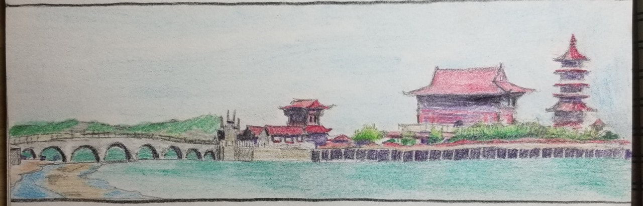
I thought it would be cool to paint, I was afraid the monotony of the mountainside wouldn't turn out as well. I ended up choosing the bottommost picture because I wanted to try out painting on a non-standard canvas. Kind of funny given that I took that picture at twelve years old, I was a better photographer back then than I am now lol.
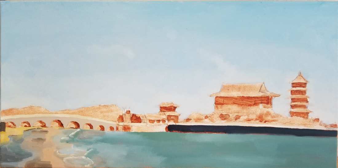
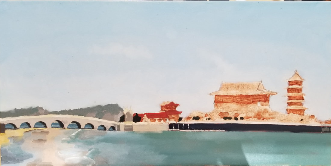
Progress Photos
Final Reflection QuestionsDescribe the craftsmanship of your painting. (Is it neat and well executed?)
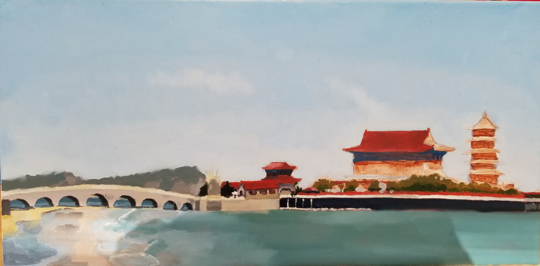
I would say that my painting is neat, but I feel that it's also simpler than what I would usually do. Probably just a result of being on a time deficit and the picture itself lacking much detail (and also because I'm lazy ;P). I do wish that I greyed down the mountains in the back because they look rather eye catching. Otherwise, I think I did a good job with executing this painting. Describe your choice of colors/color harmonies and how you used them throughout the artwork. As always, I used my favorite contrasting colors: red and blue. The background of this piece is dominated by cool colors, especially blues. In contrast to this, the buildings are a bright red. I feel this helps this piece establish a focal point and really ties it all together! How did you create contrast in your painting? I sort of answered this question in the previous one! Not only did I use colors to create contrast, I also used the difference between nature and manmade structures. The contrast between these two elements draws the eye to my focal point, the red buildings, while also grounding them in the grander scheme of the painting with the nature in the background. How did you apply textures, highlights and shadows to enhance your artwork? This painting is a little different as my textures, highlights, and shadows are all rather flat. Though this wasn't intentional when I began the painting, I grew to like it! Kind of makes the whole thing look almost minimalistic, which fits the sort of "dreamy" atmosphere I was going for. This painting would look pretty cool on a wall... How were you able to create depth in your painting? Though most of the focal points of my painting are all on the same plane, I did create depth further back by greying down objects that are farther away. However, I wish I greyed down the mountains more; I think that would've given the painting a bit more depth. What painting techniques did you use that made your painting successful? I just went about this painting as I would normally, painting the background first and then moving on to more important parts as I went along. I found myself using a soft flat brush the most (the smaller the better) because I liked the way the soft strokes almost made the painting look fuzzy and somewhat nostalgic. I often found myself painting a base layer first, waiting for it to dry, and then painting details over it. I wouldn't say this was intentional though...more a product of not having enough time to finish -U- I think it affected the way my painting was textured, though (some details were bumpier while most of the painting was flat. Does this make sense?) Describe any difficulties you had creating your drawing and what you could do to improve your drawing? I was really going at the speed of the wind while painting this, so I realize the painting isn't particularly detailed or realistic. Honestly, I'm pretty fine with this outcome--I was never painting with the intention of making it look exactly like my reference, as even my original photo had its flaws (the colors weren't as vibrant as I would have liked). Overall, I don't have many complaints...though I do wish the ocean line was completely flat. I swear that bump is taunting me, and I can't even fix it without going over the entire bridge part again -_-' Another difficulty was definitely the measurements of the canvas. I had thought the canvas was long enough to fit my picture comfortably inside, but no--apparently twelve-year-old me loved to go crazy with the panoramas. My original reference was just way too long for any canvas. My two choices were to either crop the picture or fit it all in with a ton of blank space for the ocean and sky. I chose the latter option because I had thought part of the charm of the reference was its sprawl, and also because I had already sketched it all out and didn't want to change it. I do think that painting would look better without the top 1/5 of the canvas, but there isn't anything I can do so I'm cool with it 👍 Explain the successes you had with this painting. In my opinion, my painting did turn out pretty close to my reference. I just updated the colors to look more visually pleasing. I'm pretty fond of minimalist paintings, so I ended up being pretty happy about the painting not turning out photo-realistic (at that point, I could've just run the reference through photoshop...) I also love the gradient of the sky--it looks super smooth and was fun to paint! Once I bring this bad boy home, I'll definitely hang it somewhere in my living room.
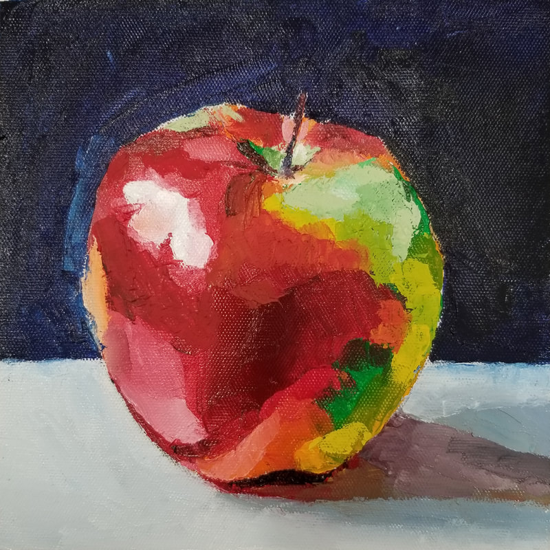
We were also using colors that I wouldn't choose normally (esp. the permanent green light), but I ended up really liking the outcome. The apple looks vibrant and 100x more radioactive than the reference, which I enjoy. However, the texture of the permanent green light was absolutely horrendous to work with and it created a black color when mixed with the red (not a good look). I tried to cover up some of the parts I messed up on with more photo-accurate greens later on, but the previous paint had already dried so it was difficult to get the revamped paint into the grooves left by the extremely neon green.
I gave the piece a dark blue background because I like dark backgrounds. I think it really makes the apple pop out of the canvas! Prompt: Do a practice painting...in oil.
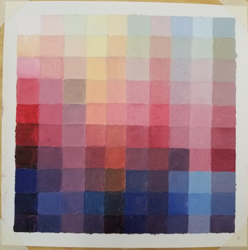
Prompt: Paint 100 unique colors using oil paints.
Actually, I feel like this method of ordering the paints helped me finish the project much faster than if I just randomly blended colors and placed them wherever. I started off with the leftmost column and started picking the colors which I deemed to be the most "vibrant" in a descending order from lightest to darkest. Then, on the top row, I picked the random colors and used a ton of white to make light colors. I systematically combined the color from the row and the color from the corresponding column to make the colors for each square. This way I could be sure that none of my colors are the same as one another, because I used different components to make each of them (although some of the colors are very, very similar).
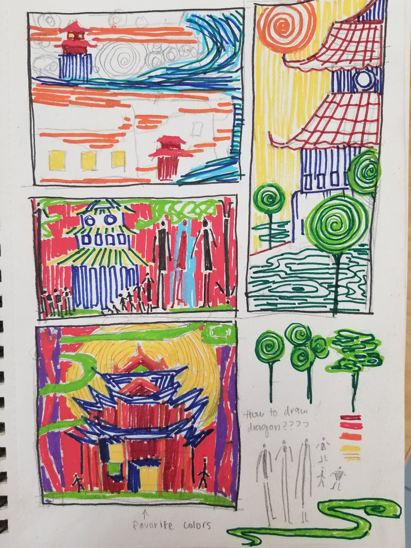
*The "white" on the top left corner is actually white blended with a bit of red Prompt: Paint an abstract piece in the style of Hundertwasser and/or Klimt. Brainstorming Ideas + Compositional Sketches
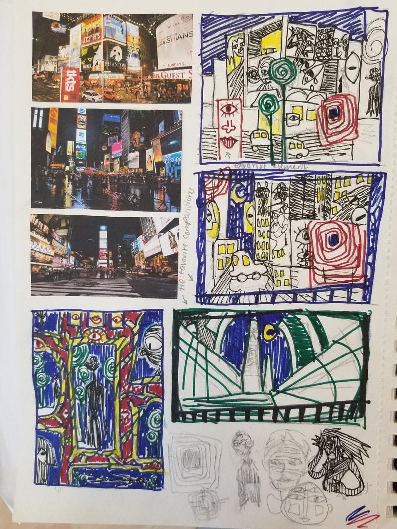
Actually, the first ever idea I had for this piece was the one on the very bottom left, with the mirrors depicting a person standing at various angles. I wanted to encapsulate the five senses in the sketch so I littered various eyes and mouths around the piece. However, I decided not to do it because I thought it didn't contain as many spirals as I would have liked. The pieces on the first page are based off of the reference photos of cities that I glued onto the paper. I had recently visited Washington D.C. so I felt I needed to quickly profit off of the city vibe (and because I like the cool reflections of lights on the street on a rainy day). My favorite sketch on this page was the one with a lot of warping in the perspective. I really loved the look of the looming buildings, so much so that it stayed in my mind even though I definitely put the least effort into that sketch. My favorite (and most developed) sketch is the bottom one on the second page, with the red background. The red just looks nice when paired with the yellow moon and green clouds. I also felt like I nailed the perspective so that the building sort of looks "godly." Though this was my favorite sketch by far, I decided not to do it since I reasoned part of why I liked it so much is just because I really like the look of red posca pen. I also wanted to include some nod to my original idea of the five senses, which wouldn't fit with the feel of the piece. I included two motifs throughout most of my sketches--eyes and those little stick figure things. I continued these ideas in my final sketch. Final Colored Sketch
Because oftentimes the works of Klimt and Hundertwasser have some sort of thought or idea incorporated in them, I tried to convey my own ideas through my piece. I greatly pushed the perspective of the buildings so they loom over the street, contributing to an oppressing aura. I tried to make it so the city was "swallowing" the viewer whole. The eyes were symbolism for being watched and monitored, a feeling often felt in a city with many people. The figures on the left buildings were representative of the feeling of spiraling out of control, depicted in a literal manner. Now saying it, it sounds pretty pretentious haha...but at the time I was feeling artsy (͠≖ ͜ʖ͠≖) In Progress Photos
Final Painting Self-Evaluation Describe the craftsmanship of your painting. (Is it neat and well executed?)
Yeah, I think so! I mean, I did color in the lines (͠≖ ͜ʖ͠≖) so I suppose I could count this as a win. Some of the patterns were really hard to do, especially the circular pattern around the moon--those were pretty hard to not make a mess. How does your work embody the artist’s style? I feel like I went a different route than most of my classmates when embodying the artist's style. Hundertwasser's style could very accurately be categorized as "child-like," but instead, I chose to go down the "horror" path. Some of his art is vaguely unsettling and weird, not really helped by his choice of vibrant color that hurts the eye. I tried to encapsulate that "off" sort of feeling by leaving my painting bright red. One thing I wish I would have done further is stuff my painting with even more patterns--Hundertwasser's and Klimt's paintings are always chalk full of patterns upon patterns; that's what makes them so interesting to look at! Describe your choice of colors/color harmonies and how you used them throughout the artwork. My painting is very red. Red is an uncomfortable color (for me) as it is the color of blood, which is pretty gross. I wanted my painting to have an uncomfortable aura, which is why I chose to use an uncomfortable color. To offset this red, I chose to use a dark blue color to differentiate between the eerie glow of the city with the night sky. I used a teal color as an accent to draw the viewer's eye to all the eyes in the painting. What is the emphasis (focal point) of your artwork? I would say the main emphasis of my painting is the standing man in the building. He's reaching out a hand and saying "hi!" He also may or may not be trapped inside that building and trying to escape...who knows? So many mysteries! How did you use textures and patterns to embellish your artwork? I tried my best to incorporate a WHOLE lot of patterns in my painting, my favorite of which is the one I used for the moon (which is lots of abstract eyes made by spirals). I used textures on the buildings by subtly using a shade slightly lighter/darker than the red background, and cast a reflection of the painting in the street (does this count as a pattern?). There's a lot more I put in but I really don't want to list them all out sorry ms. rossi im tired How did you put a border/spiral on your artwork? How does it enhance the work? The background is a spiral, as in, there is spirals in the moon and around the moon. My intention was to give the center of the piece a "hypnotizing" feel and draw the eye towards the focal points of my artwork. I also drew little spirals here and there, especially in the teal parts. Again, since I wanted people to focus on those aspects, I put more effort into them. I also drew silver spirals on my border (a fence and telephone-pole type thing, dunno how it would work logistically but I just wanted the border to make more sense within the context of the piece), though I kind of regret it because it takes away from the actual painting and more to the blindingly bright border. Although, since it does make the painting more Hundertwasser-like, I decided to keep it in. Describe any difficulties you had creating this artwork. I feel like since this style is such a big departure from my regular style, I had trouble pushing my brain to the limit. I was really struggling to come up with things to add to the piece since I didn't have any reference to go off of--I also wish I would've pushed the perspective of the piece more because it looks kind of flat. By the time I realized, though, I was already too far into painting to change anything. Explain your successes and the importance of planning and revising sketches to achieve desired outcome. Without planning out all my ideas, I don't think I would have painted what I did at all--I probably would have just went with the mirror idea, which I feel like would be a lot weaker. Also, in my sketch, some of my lines were straight and did not lend themselves to the warped perspective I was going for. I changed them to a more rounded look in my actual painting. If I had made them straight like before, there's no doubt my painting would look extremely wrong, and not in an intentional way. How can you use what you learned from this painting to enhance your future paintings? I learned to be creative. I know I basically say this in the reflection of all my projects, but I actually mean it this time and am not just putting it because I can't think of anything else. What better way is there to learn to be creative than painting a bright red painting with eyes all over it, based off a man whose artwork makes it look like he paints on acid? In my future paintings, though I'm not intending to make all of them red and eye-filled, I plan to use some of my creativity and artistic interpretation to paint things with meaning. Prompt: Paint a fruit with acrylic paint. Photo Reference
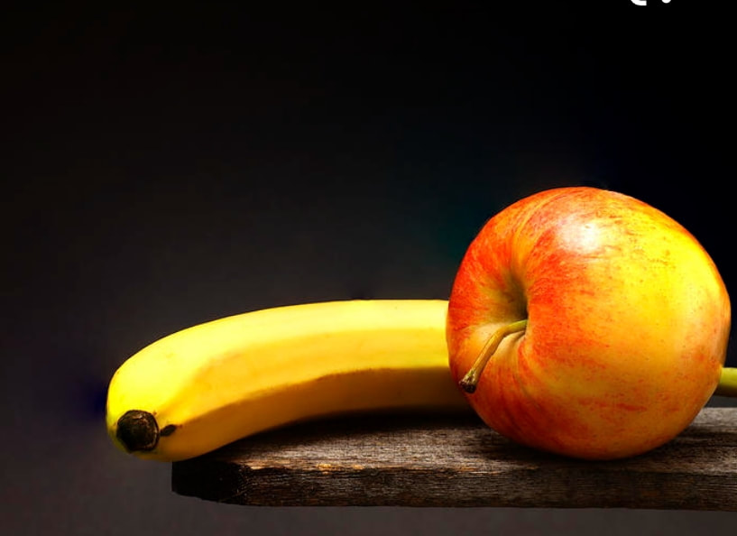
Final The photo sucks so there's a huge glare on the paper -_-
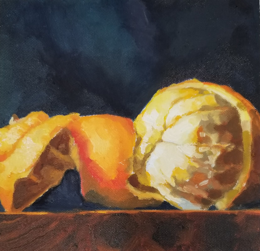
I've had a few comments that it looks as if I painted on black paper, though I actually painted on normal white paper. That's just how smooth the background is! Super satisfying. I wonder what type of paper Ms. Rossi gave us... I like the contrast between the blindingly white banana and the dark blue background. The apple doesn't look too bad either. I used the same style I usually do, just blocking colors and values on paper. I'm surprised how nicely it translated with acrylic paint! Prompt: Color wheels with a special twist!
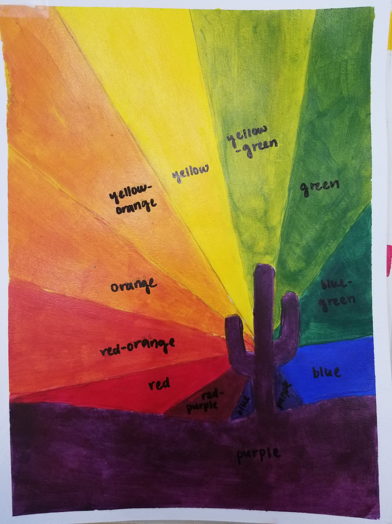
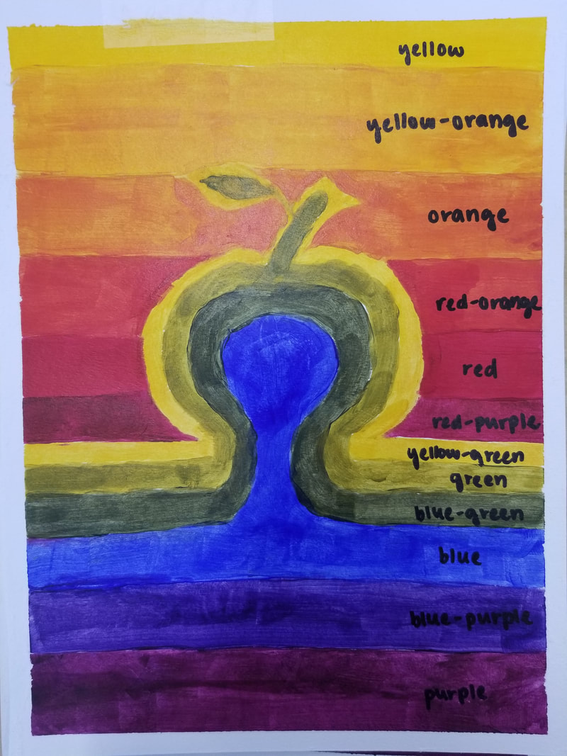
For my color wheels, I decided to do something more different and cover the entire page (this was just an excuse for me to peel off tape at the end haha). I made a cactus for my first one with circular cross-sections, and a pumpkin for my second piece with horizontal colors like a sunset (getting into the Halloween spirit!)
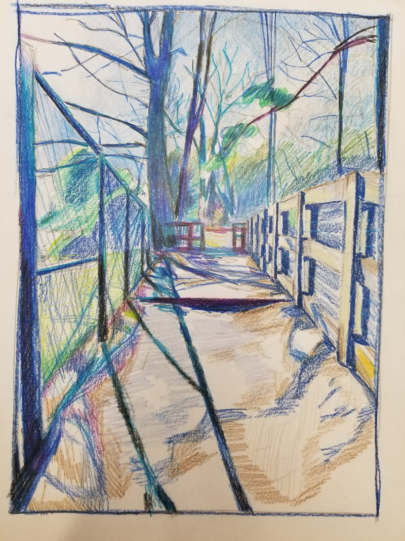
About how I feel about these...well, it's sort of complicated. I guess my ideas were somewhat original, but they look like kids' drawings :P. They were really fun to do, still. It was nice to just relax and monotonously color inside the lines for once~~ Reference Photo & Compositional Sketches
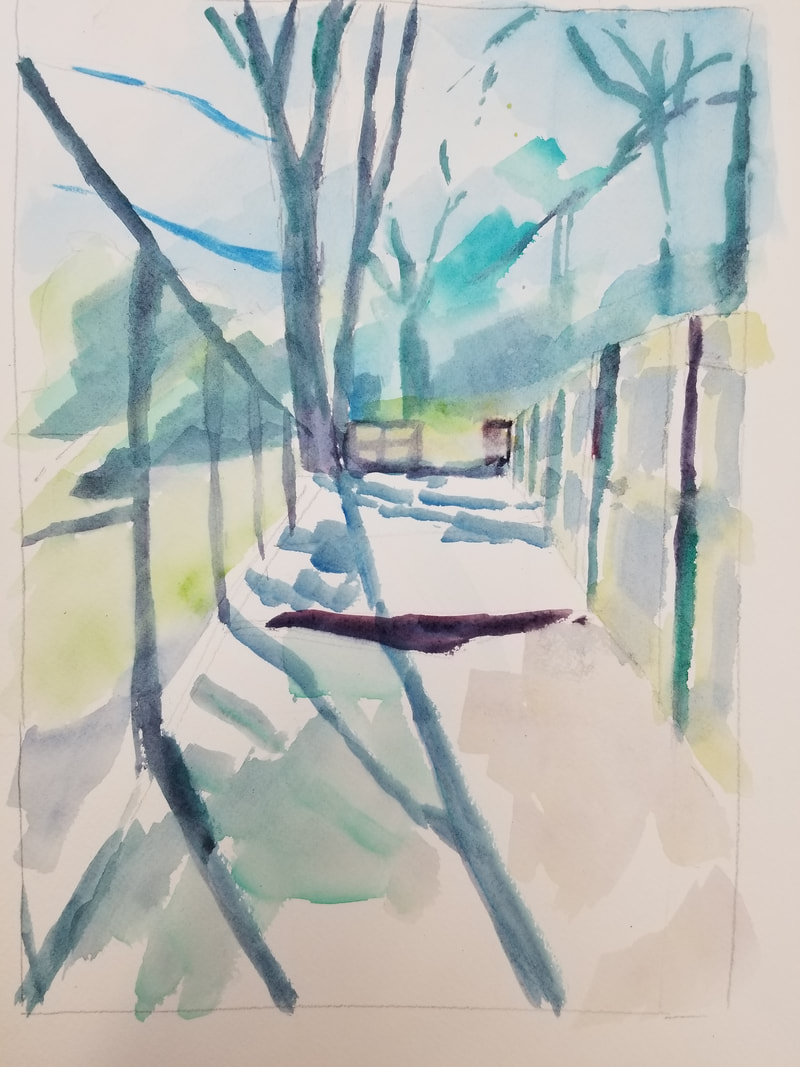
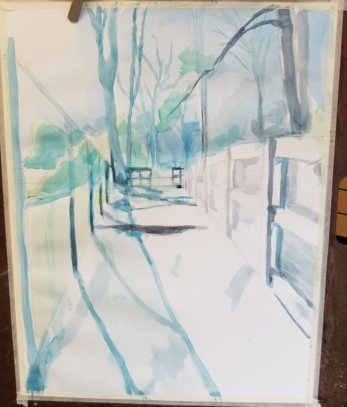
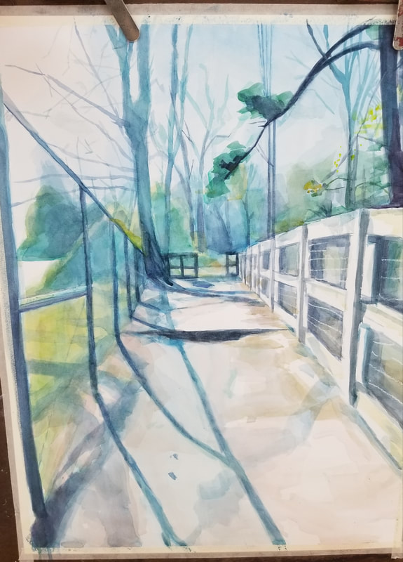
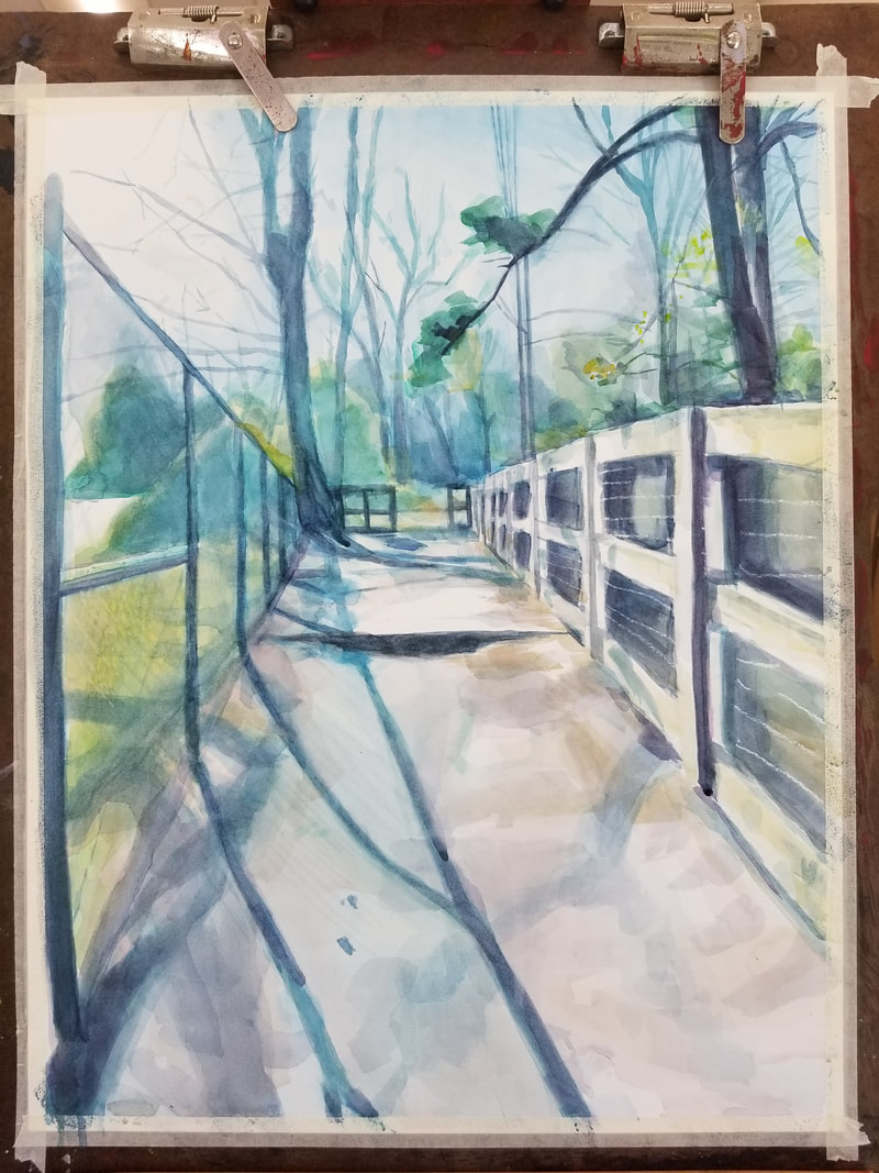
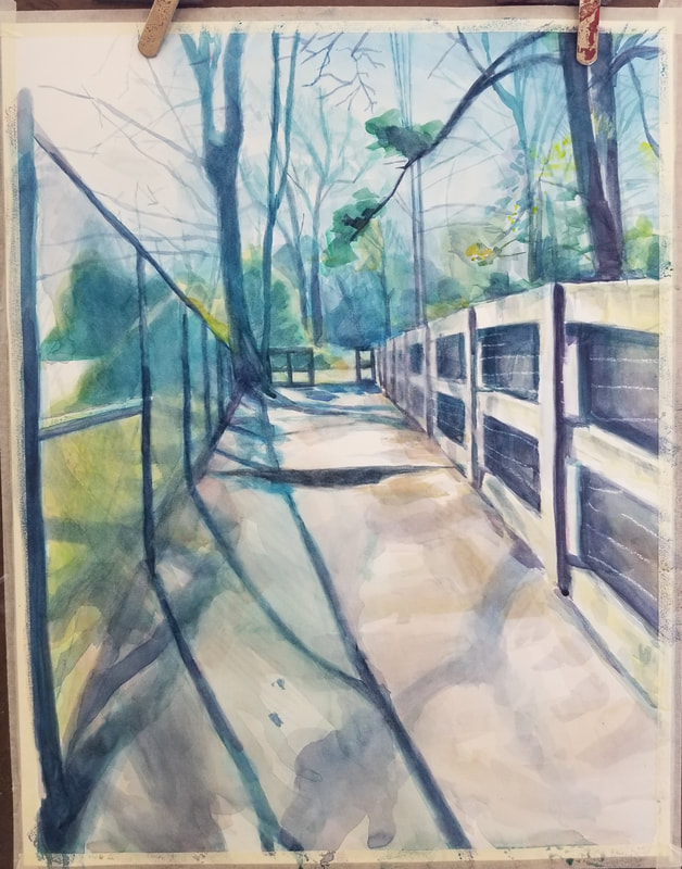
In-Progress Photos
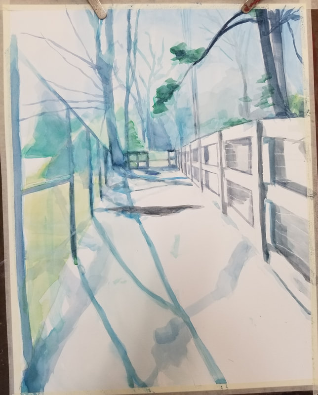
Final Painting Self Reflection Questions1. What watercolor techniques proved to be effective in your painting? How and Why?
I mainly used the wet-on-wet technique at first, which proved to be a bit disheartening as it was extremely difficult to get everything evenly wet on such a large paper. It seemed as if the paper was very absorbent as well, so most of the water only served to make the paper crinkly. After, I mostly used dry brush techniques for the rest of my painting, especially towards the front. This was okay, but the opacity of the paint was just not it. This probably had to do with which type of paint I used (in tubes). 2. How important was using transparent layers in your painting? Using transparent layers was the crux of my painting. Basically everything in the painting, I built up with transparent layers (though some of this was not my intention, but rather the effect of watercolor). I had to be pretty careful about how much water I was using, as too much water only served to tear up the paper. An effective counter method I used was just jumping around different parts of the piece--I would work on one area for a few strokes, then move to another place. 3. Explain how your composition was successful? Did you utilize all the elements of art and principles of design? Explain. I actually really like my composition (even though it was just based off of one single reference). The directness of the path sort of symbolizes how, even if life is difficult, you keep moving forward...though maybe I'm just reading too much into it. :P Too be honest, I don't even know what the elements of art and principles of design are. I just have a gut feeling that I like it! 4. Was color choice an important factor in the overall success of the painting? Why? Yes, for sure! As I mentioned previously, I had put a filter over my reference (a blueish-green one. I think it was called Evergreen?). This filter made everything seem more dreamy and mysterious, almost as if the woods were covered in fog. Cool stuff! I tried my best to emulate this feeling in my final painting. 5. Describe your craftsmanship. I don't really know how to describe it...but if I did, I would say that my style of painting is 'impressionistic, but lifelike.' That sounds kind of pretentious, but what I mean is that I like to paint in broad strokes (with flat brushes!) but try to include some details (like the branches). While in class, I got a few comments about how my painting was all pretty much one color (blue) but still somehow looks distinguishable. This is because I rely a lot on subtle color changes. Lots of color mixing! 6. If you were able to do something different what would it be and why? Honestly, I wish I was able to darken the entire painting more and make it more dramatic. I had high expectations coming into this project because I specialize in oil paint, which has very vibrant colors. Needless to say, watercolor cannot get as vibrant or as dramatic. I think I could work on this piece more to bring it to the next level, but honestly, I just can't bear to work on it anymore. I just want to move on at this point. 7. Explain to me what you have learned about watercolor and how it has improved or discouraged your development in art. I've learned that watercolor is freaking hard! I think doing this project was really a test of my patience, because if I wasn't patient, I would just end up ripping holes into my paper. Starting this project was like ripping my own hair out. HOWEVER, I do think that trying it out has significantly improved me as an artist...just don't expect me to do it again. |
AuthorMonica Jin Archives
January 2022
Categories |


 RSS Feed
